San Francisco PM2.5
This doesn't work any more as Purple is charging for their API. Sorry.
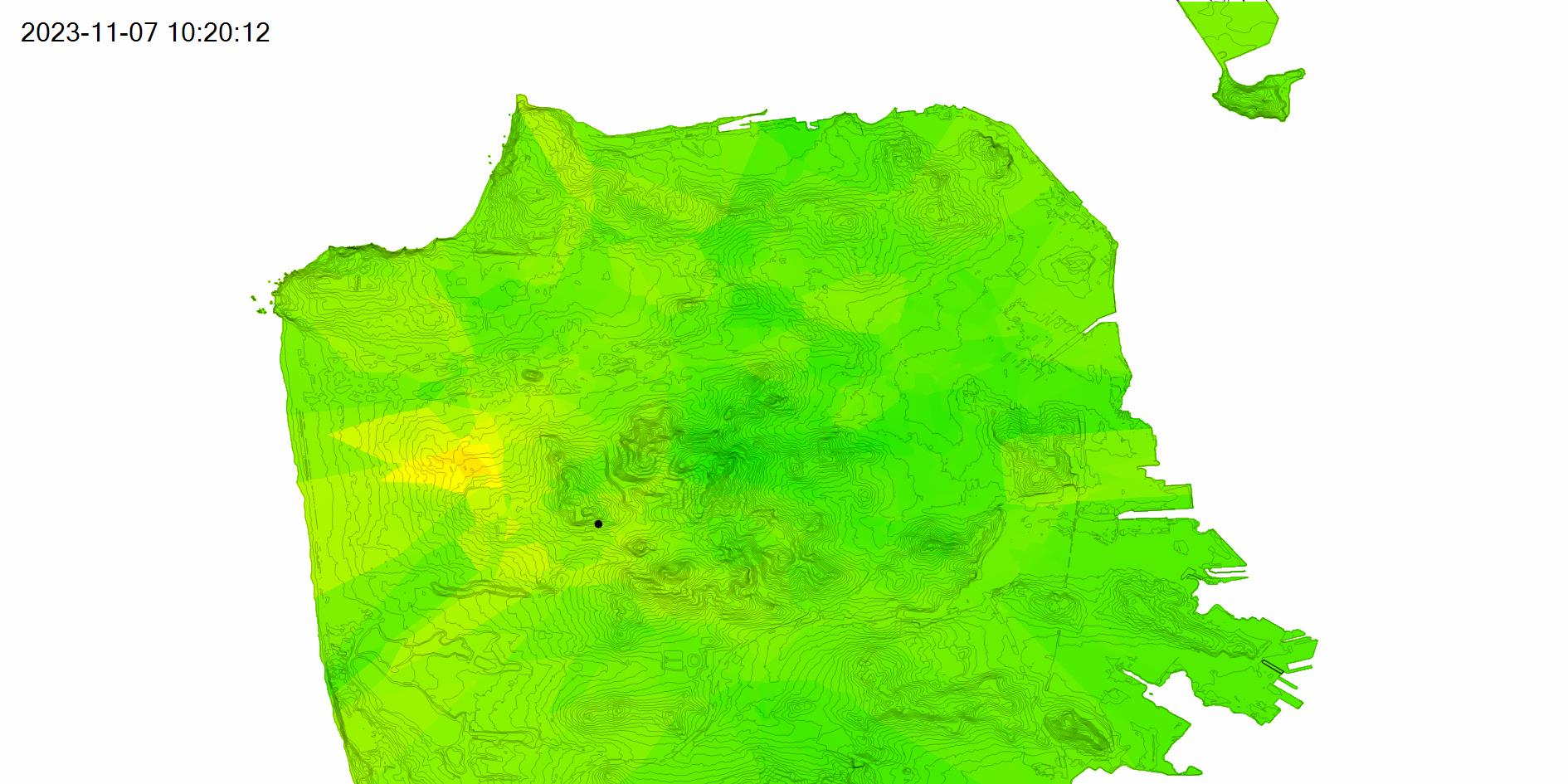
This post is updated hourly with a PM2.5 (2.5 micrometer or smaller particulate matter) map of San Francisco.
The video below shows the past 48 hours at six frames per second.
The PM2.5 data comes from the Purple Air API. The map uses one hour average readings from outdoor sensors and interpolates each point in San Francisco based on the inverse of the distance to the four closest sensors. The color scale is green to yellow (0-50), yellow to orange (50-100), orange to red (100-150) and red to purple (150-200+). San Francisco is plotted using elevation contours from DataSF.
Updated 2022-06-11 12:28:
The map is currently broken. The URL I use to download sensor data started returning a 500 error code at the end of may (Error: Server Error / The server encountered an error and could not complete your request. Please try again in 30 seconds.). This seemed like something Purple would need to fix. On closer inspection the error occurs after a redirect to https://purpleair-over-quota-2.appspot.com/ which sounds like too many requests (a 4xx error surely). With even more digging it turns out the download link is no longer supported (410 maybe then?) and so I'll need to migrate to the REST API to get this working again. I'm currently trying to get an API key and will get this fixed as soon as I can.
Updated 2022-06-13 17:28:
Purple Air were kind enough to issue me with an API key so the map is back to updating hourly.
Updated 2023-11-08 00:26:
And it's broken again. Purple have decided to start charging for their API. This is a shame, and I don't think I can pay for this just to keep this post running. I'm going to try moving to the AirNow system for some use cases, but it's not going to work for a detailed map of San Francisco as there is only one official sensor here.