San Francisco PM2.5
This doesn't work any more as Purple is charging for their API. Sorry.
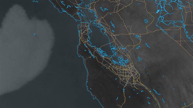
This post is updated hourly with a PM2.5 (2.5 micrometer or smaller particulate matter) map of San Francisco.
The video below shows the past 48 hours at six frames per second.
The PM2.5 data comes from the Purple Air API. The map uses one hour average readings from outdoor sensors and interpolates each point in San Francisco based on the inverse of the distance to the four closest sensors. The color scale is green to yellow (0-50), yellow to orange (50-100), orange to red (100-150) and red to purple (150-200+). San Francisco is plotted using elevation contours from DataSF.
Updated 2022-06-11 12:28:
The map is currently broken. The URL I use to download sensor data started returning a 500 error code at the end of may (Error: Server Error / The server encountered an error and could not complete your request. Please try again in 30 seconds.). This seemed like something Purple would need to fix. On closer inspection the error occurs after a redirect to https://purpleair-over-quota-2.appspot.com/ which sounds like too many requests (a 4xx error surely). With even more digging it turns out the download link is no longer supported (410 maybe then?) and so I'll need to migrate to the REST API to get this working again. I'm currently trying to get an API key and will get this fixed as soon as I can.
Updated 2022-06-13 17:28:
Purple Air were kind enough to issue me with an API key so the map is back to updating hourly.
Updated 2023-11-08 00:26:
And it's broken again. Purple have decided to start charging for their API. This is a shame, and I don't think I can pay for this just to keep this post running. I'm going to try moving to the AirNow system for some use cases, but it's not going to work for a detailed map of San Francisco as there is only one official sensor here.
Related Posts
- Animation of US PM2.5 Air Pollution in 2023
- San Francisco Crime 2003 to 2021
- Assassination Coordinates
You Might Also Like
ITHCWY Newsletter for July 2020
July has been very nature focused for me: rattlesnake, whale, ospreys, bald eagle and comet NEOWISE. Hikes include Bumpass Hell and the Devils Kitchen at Lassen Volcanic National Park.
I did fit in a whinge about Android usability.
Previously:
- 2019: How to backup Google Photos to Google Drive automatically after July 2019 with Apps Script
- 2018: What if the Senate Voted Proportionally to Population
- 2017: Email Alerts for new Referers in Google Analytics using Apps Script
Related Posts
You Might Also Like
ITHCWY Newsletter for June 2020
Coronavirus by country and US state/county - this post updates two videos daily that show increases in cases and deaths by day. Also more very local hikes.
I can't tell if Microsoft wants me to use Edge.
More ISS.
Previously:
- 2019: Bay View and Shoreline Trails at China Camp State Park
- 2018: Animation of a year of Global Cloud Cover
- 2017: Reading and Writing Office 365 Excel from a Console app using the Microsoft.Graph C# Client API
Related Posts
- Visualizing Coronavirus Cases and Deaths by Country and US County
- Coronavirus Hikes: Done
- Coronavirus Visualization Update
You Might Also Like
Visualizing Coronavirus Cases and Deaths by Country and US County
Cases and Deaths by Country
Week on Week Incremental
Cumulative
Cases and Deaths by US County
Week on Week Incremental
Cumulative
This post visualizes global and US county level coronavirus data from Johns Hopkins University. Four videos show both cumulative and week on week progression (comparing seven day moving averages) of the disease together with four images that show the most recent snapshot. It used to be updated weekly, this stopped August 5, 2023.
Cases and deaths are shown simultaneously using blue for cases and red for deaths. Where both are high a region will be a shade of purple. Regions with no data are dark gray.
The week on week incremental visualization is useful to see the history and current state of the spread of coronavirus. Each region is shaded based on the highest number of daily cases and deaths for that region and is relative to population. For example if the highest number of deaths reported on any day in San Francisco county is seven, then any day that has seven deaths will be the brightest shade of red. This shows where COVID-19 is relatively bad over time.
The cumulative visualization is shaded relative to the highest total death and case count for any region, relative to population.
As the location and date of the peak in week on week and cumulative cases and deaths change over time the videos will be different each time you watch. Bookmark this post and check back for weekly updates.
(This is the fifth version of this post as I have changed the data source and methodology several times. I usually preserve the previous version of any post but the changes are large enough that in this case I have removed them).
Cases and Deaths by Country
Week on Week Incremental
Cumulative
Cases and Deaths by US County
Week on Week Incremental
Cumulative
Related Posts
You Might Also Like
ITHCWY Newsletter for May 2020
4K video of an International Space Station lunar transit on May 7.
Coronavirus hikes.
Timelapse of stars over San Francisco.
Catfood Software updates: Earth 4.01 and WebCamSaver 3.21.
Previously:
- 2019: Tire Chalking Constitutional Amendment
- 2018: I just want to get rid of Windows 10 Notifications with one click
- 2017: Real Time
Related Posts
You Might Also Like
ITHCWY Newsletter for April 2020
A 4K one year global cloud cover timelapse.
Niche topic maybe, but if you want to monitor Azure app services via Google Sheets then I've got you covered.
Previously:
- 2019: Improving the accuracy of the new Catfood Earth clouds layer
- 2018: How does the Nest Learning Thermostat work?
- 2017: The Harvard Business Review Fallacy
Related Posts
- Animation of a year of Global Cloud Cover
- 4K One Year Global Cloud Timelapse
- Daily Average Global Cloud Cover Animation
You Might Also Like
ITHCWY Redesign
I've just launched a redesign of I Thought He Came With You. The main thrust is to make the site more usable on desktops. Which seems nuts, but the data doesn't lie. The site has low mobile traffic and for a while I thought this was some kind of technical issue. I optimized the design heavily for mobile and spent a lot of time on speed and some AMP. I guess it's the content. Google loves it when I write documentation for them and doesn't think I have anything useful to say on politics. They're probably right. So I've gone back to having an old school sidebar and I've taken the performance hit of using Bootstrap to get some better looking forms and navigation without spending a lot of time on it. I hope you enjoy it, and if you find anything broken please email or leave a comment.
Related Posts
You Might Also Like
ITHCWY Newsletter for March 2020
More Bangalore: Timelapse featuring Tipu Sultan's Summer Palace, Lalbagh Botanical Garden, KR flower market, Bangalore Palace and Cubbon Park.
Coastal: an abstract timelapse of the California coast.
Jesse Wegman has written a book, Let the People Pick the President: The Case for Abolishing the Electoral College (review) and a NYT op-ed on switching to a more rational way of electing the President. If you support this idea I have a page on the topic with four concrete things you can do to help.
Hike to Kirby Cove Beach (Marin Headlands near San Francisco).
Tool to backup locked files on Windows 10 - great for XCOPY backups or just grabbing a locked file.
Previously:
- 2019: Age and Life Expectancy Weighted Voting
- 2018: Facebook shouldn't own your social graph
- 2017: Book reviews for February 2017
Related Posts
You Might Also Like
News: We May Be Living in a Simulation, but the Truth Still Matters
We May Be Living in a Simulation, but the Truth Still Matters
I like this article because Kara Swisher actually gets the history right. Read my series on this starting with Can I move to a Better Simulation Please?.
Related Posts
- Can I move to a Better Simulation Please?
- Have we Already Proved that the Simulation Hypothesis is False?
- Was there ever any doubt that I would eventually write this post?
You Might Also Like
ITHCWY Newsletter for January 2020
A timelapse portrait of San Francisco on New Year's Eve 2019.
Hike: Mt. Livermore on Angel Island
Catfood Earth 4.00 has been released. The new version includes 4K remastered day, night and cloud images as well as the latest timezone database.
It's a month for updates - you can also grab Catfood WebCamSaver 3.20 which includes an updated list of working webcams around the world. WebCamSaver is a Windows screensaver that shows you a feed of open webcams.
Meeting defragmenter is real!
How to fix the Washington Post democratic candidate quiz.
Previously:
- 2019: Amazon Alexa Echo Wall Clock Review
- 2018: I'm not afraid of Google
- 2017: I didn't think I'd ever fall for fake news of Facebook