Coronavirus Visualization Update
I've just made a few changes to my daily Coronavirus Visualization post.
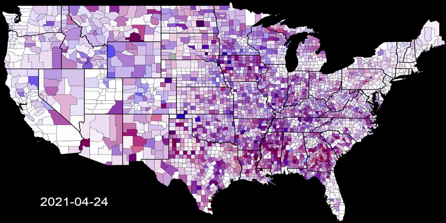
The daily version is now based on seven day moving averages. This helps with the rate at which different regions report statistics and makes the animation a but easier to follow. The shading is based on the difference between the average yesterday and the average for the previous day (i.e. today it's the increase from April 17 - 23 to April 18 - 24).
Population scaling is now different between the daily and cumulative versions. Daily frames are scaled to the worst recorded case and death increase for that region. Cumulative frames are scaled to the cumulative highest case and death levels, but each region is scaled by population so the highest level is on a per capita basis not an absolute total. For the US animation this uses 2019 estimates from the US Census Bureau. The global animation the figures are 2018 World Bank estimates.
Finally the frame rate for videos has increased to 24fps from 5fps.
The post Visualizing Coronavirus Cases and Deaths by Country and US County updates around 8:30am PST every day with images summarizing yesterday and videos that show the course of the pandemic so far.
Add Comment
All comments are moderated. Your email address is used to display a Gravatar and optionally for notification of new comments and to sign up for the newsletter.