San Francisco 311 Cases Animation
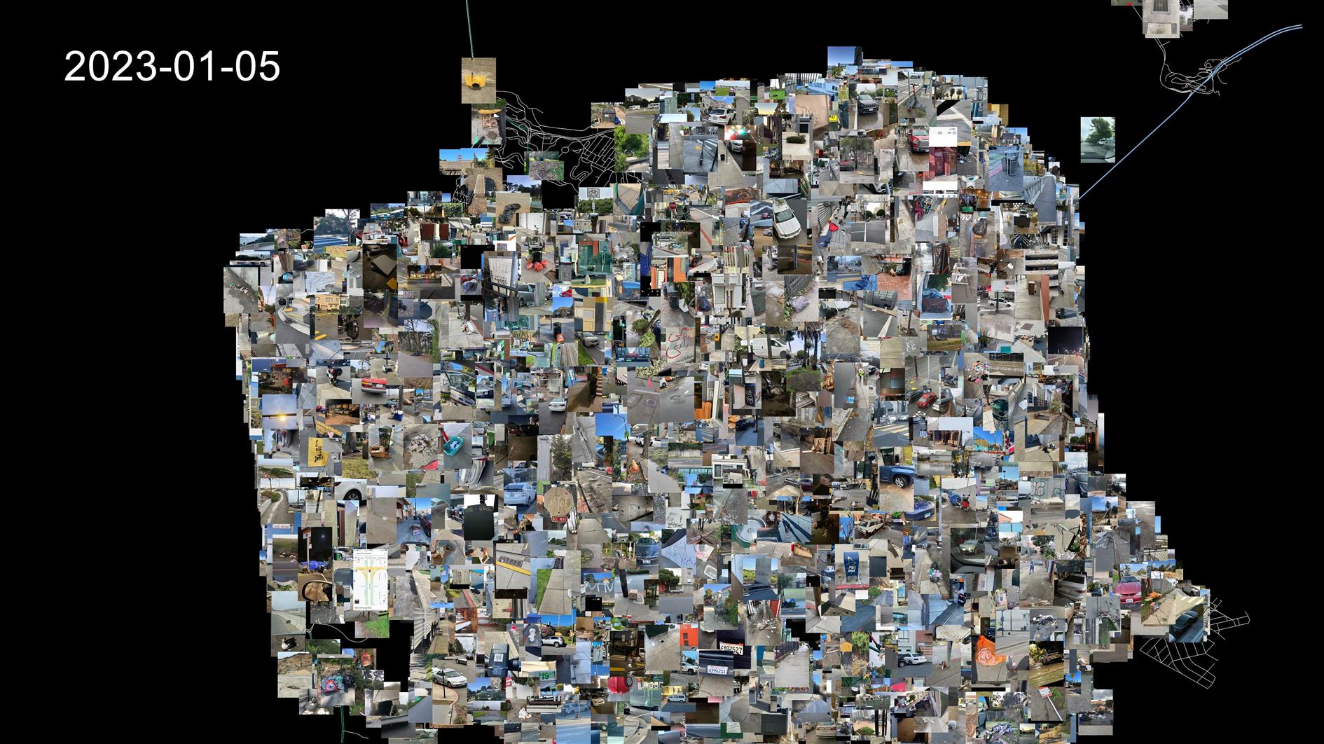
This animation shows a random sample of 311 cases that have a photo and specific location. It covers July 4, 2013 to January 5, 2023. Created using the 311 dataset plotted over a street map of San Francisco.
Related Posts
- San Francisco Crime 2003 to 2021
- Assassination Coordinates
- San Francisco New Year's Eve Timelapse 2020
- San Francisco Street Tree Datalapse
- Coronavirus Visualization Update
(Published to the Fediverse as: San Francisco 311 Cases Animation #etc #video #animation #sanfrancisco #311 Animation of a sample of San Francisco 311 cases from 2013 to 2023 (photo and location) )
Assassination Coordinates
Testing out some shapefile code with a zoom into San Francisco. This uses five different shapefiles:
Country borders are from Eric Muller's fips-10 shapefile.
States and US Counties come from the United States Census Bureau.
San Francisco 5 foot elevation contours from DataSF.
Finally the street map for San Francisco is from data.gov.
These are almost all based on different projections and I did my best to actually line everything up but if you're heading over for coffee it's probably best to stick with Google Maps.
Related Posts
- San Francisco 311 Cases Animation
- San Francisco Street Tree Datalapse
- San Francisco Crime 2003 to 2021
- Coronavirus Hikes: March 2020
- Timelapse, Week of Jan 17 2022
(Published to the Fediverse as: Assassination Coordinates #etc #video #sanfrancisco #shapefile #animation Animation that zooms from a global map to the streets of San Francisco using five different shapefiles. )
Change in Presidential Vote from 2000 to 2020 by US County
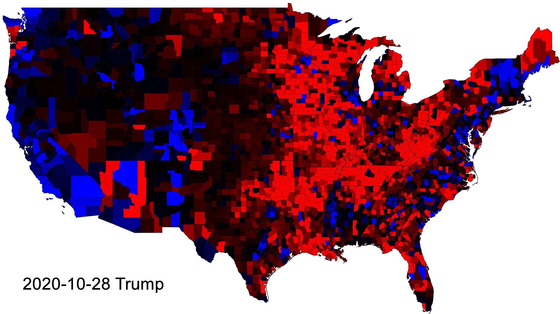
This animation shows how the presidential vote in each county changed from 2000 to 2020. Every step in the animation shows the lift from 2020 with counties that voted more Republican shaded red and Democrat blue.
The blue shift towards Obama and then the Red shift towards Trump make a lot of sense. I find it really interesting how little changes between Trump and Biden.
Note that the colors represent the change in share of the vote and not an absolute measure. A country that went from 70% Republican to 60% Republican would be shaded blue due to the shift towards the Democrat vote. The vote is interpolated linearly between elections and so when you're looking at 2016 to 2020 for instance the animation shifts each county towards the votes that they will cast in 2020. Like the electorate I ignore third parties.
Data is from Harvard Dataverse. The animation and any errors introduced in its fabrication are all me.
Related Posts
- Age and Life Expectancy Weighted Voting
- 2020 Results
- Visualizing Coronavirus Cases and Deaths by Country and US County
- Coronavirus Visualization Update
- Fuck the Electoral College
(Published to the Fediverse as: Change in Presidential Vote from 2000 to 2020 by US County #politics #video #animation #election Animation of changes in the Presidential Vote by US County, covering Bush, Obama, Trump and Biden (2000-2020). )
Space Journey

Animation of a trip through a random collection of stars with a bit of a hyperspace effect in the middle. I didn't mean to write this code but it's what ended up happening anyway. It would make a good mid-90s screensaver. I'll post what I was actually trying to do next.
Related Posts
- Star Trails
- ASCII Sunset
- Blue Marble 2 Animation
- Mandelbrot Spin Zoom
- Animation of a year of Global Cloud Cover
(Published to the Fediverse as: Space Journey #etc #video #space #stars #animation 4k animation of a journey through a random collection of stars including some hyperspace effects and music. )
Stable Diffusion Watches a Security Camera - a short horror movie
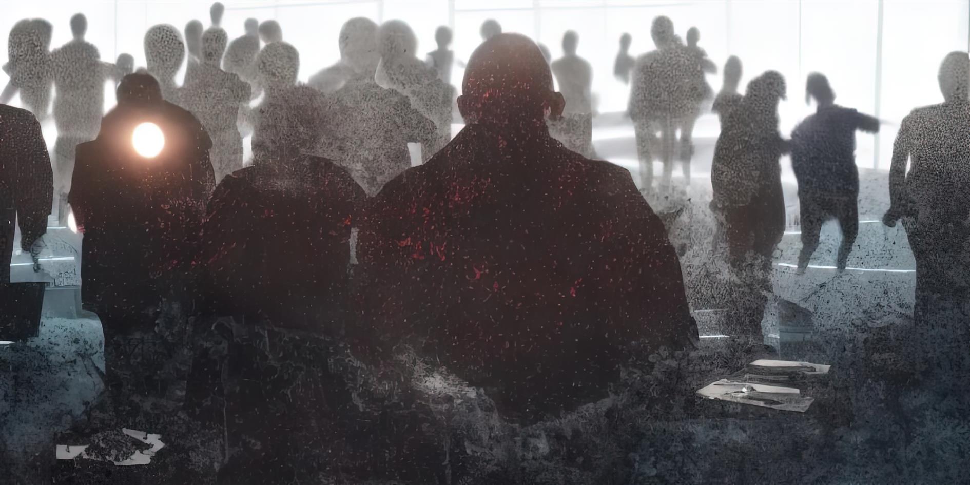
A horror movie made by forcing img2img to watch a Japanese security camera over 24 hours.
The office was empty, so the main influences are sunrise and sunset and then just subtle shifts in lighting. In terms of settings, strength was 0.75 with scale of 6.6 so the animation doesn't look anything like the actual office in question. The prompt was "photo of something unspeakable lurks in the shadows of the office, high quality, cinematic lighting, subtle horror, horrifying, japanese, found footage, sharp focus, 8k, no text". I upscaled with Gigapixel AI and then added some music.
Related Posts
- A black lab chases a Roomba and then things start to get weird...
- Diary of a Living Room
- World Webcams 2
- Stable Diffusion Animation of Scale Parameter
- The color of yesterday
(Published to the Fediverse as: Stable Diffusion Watches a Security Camera - a short horror movie #etc #video #stablediffusion #ml #4k #animation A horror movie created by forcing Stable Diffusion to watch a random Japanese security camera for 24 hours. )
A black lab chases a Roomba and then things start to get weird...
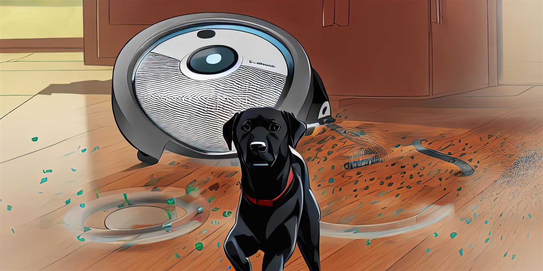
Another experiment with Stable Diffusion (see my San Francisco skyline video from earlier today). This one uses img2img instead of txt2img. I started with a video of my dog following the Roomba around the house. I dumped all the frames out and then used Stable Diffusion with the strength parameter ramping up from 0.0 (source image preserved) to 1.0 (source image ignored) and a scale of 11.5. The prompt was "illustration of a black labrador being chased by a giant scary roomba trending on deviant art". The frame at the top maybe best captures this concept. I used Gigapixel AI to scale the output back up to 4K resolution and then added the original soundtrack.
Related Posts
- Stable Diffusion Watches a Security Camera - a short horror movie
- Stable Diffusion Animation of Scale Parameter
- Style Transfer for Time Lapse Photography
- World Webcams 2
- Bay Bridge Timelapse
(Published to the Fediverse as: A black lab chases a Roomba and then things start to get weird... #etc #video #animation #stablediffusion #4k #ml Stable Diffusion img2img generated from a video of a dog chasing a Roomba. )
4K One Year Global Cloud Timelapse
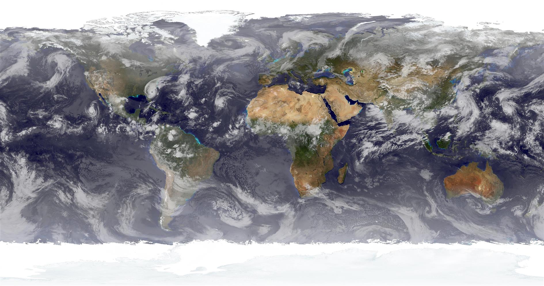
Six 4K images a day at 24 frames per second (so each second is four days) from April 18, 2019 to April 17, 2020:
I made a version of this video a couple of years ago using xplanet clouds. That was lower resolution and only had one frame per day so it's pretty quick. This version uses the new 4K cloud image I developed for Catfood Earth just over a year ago. I've been patiently saving the image six times a day (well, patiently waiting as a script does this for me). It's pretty amazing to see storms developing and careening around the planet. The still frame at the top of the post shows Dorian hitting Florida back in September.
Related Posts
- Animation of a year of Global Cloud Cover
- Daily Average Global Cloud Cover Animation
- Global Cloud Cover 48 Hour Video Updated Hourly
- Time Zone Time Lapse
- World Webcams 2
(Published to the Fediverse as: 4K One Year Global Cloud Timelapse #code #software #video #timelapse #animation #clouds #earth Animation of a year of global cloud cover from April 18, 2019 to April 17, 2020. You can see storms developing and careening around the planet. Rendered from six daily 4K images. )
Game of Death

Conway's Game of Life, for 1,830 generations, starting from a random pattern. Instead of showing the live cells this animation focuses on death - each dead cell gets a little bit greener with each generation. You can just about make out a few static patterns in the darkness and the lines cruising through are left behind by gliders. Mostly though you're watching the horrible loss of life caused by cellular social isolation.
Related Posts
- Life, Non-locality and the Simulation Hypothesis
- Draw the rest of the Hummingbird
- Coronavirus Visualization Update
- The color of yesterday
- Stable Diffusion Watches a Security Camera - a short horror movie
(Published to the Fediverse as: Game of Death #timelapse #animation #conway #life #death #video Animation of Conway's Game of Life flipped to focus on the fate of the dead cells. )
Global Temperature Anomalies Animation, 1850 to 2018
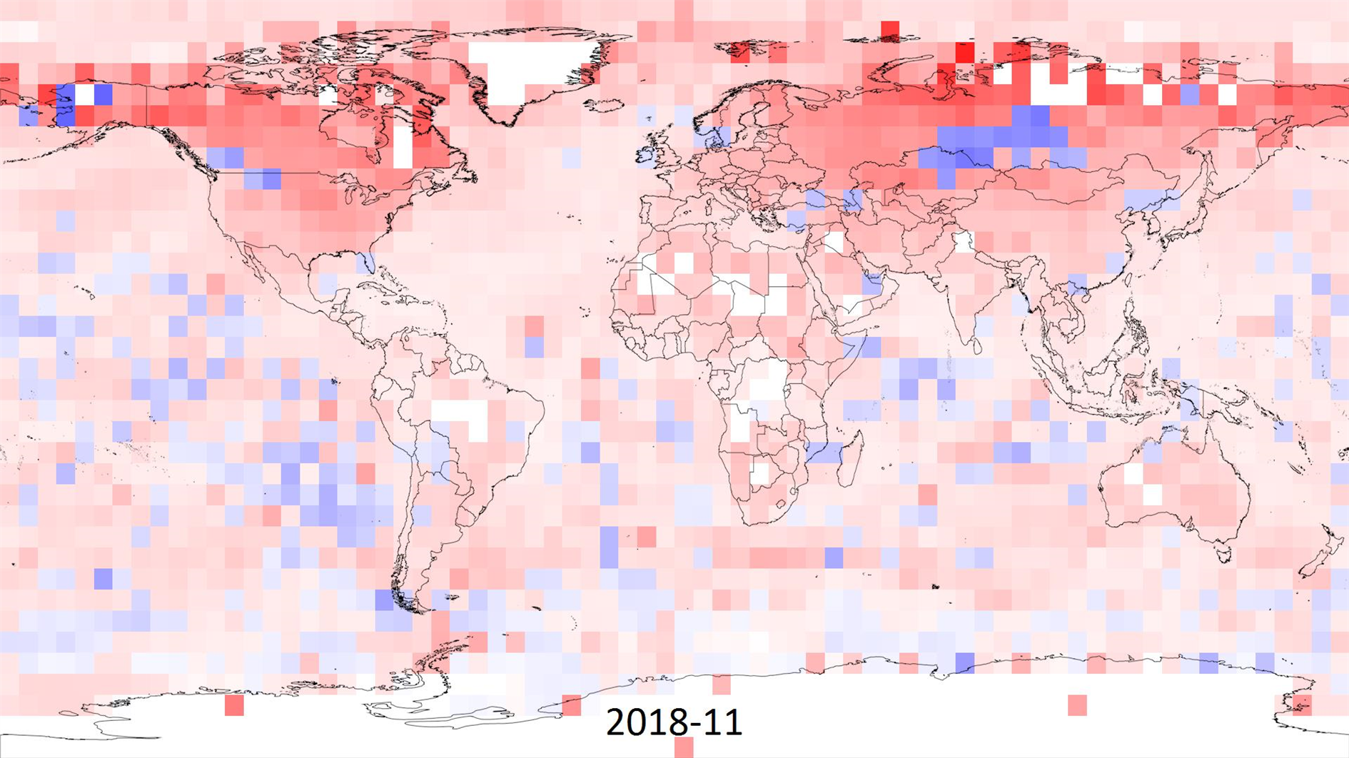
I made this animation to visualize climate change based on the HadCRUT 4 data (specifically the ensemble median gridded data) from the Met Office Hadley Centre.
HadCRUT 4 provides temperature anomalies in a five degree grid by month and year from January 1850 to November 2018 (as of this post). Anomaly here means deviation from the 1961-1990 average.
In the animation I wanted to capture the full timespan of the data but also show long term trends. Each frame is a month of data and each five degree grid of longitude and latitude is colored based on the maximum cumulative anomaly (positive or negative) for each decade. The range for color is 0 to +/- 20.85 degrees, red for warmer and blue for cooler. This means there is a reset at the start of each decade, the first few years are mostly random noise but by the end of each decade you're seeing the range of extremes.
Spoiler alert - you can spot something happening in the last three decades.
As well as the change in temperature it's interesting to watch the increase in global coverage over time. It's surprising that even the most recent years have no readings for Antarctica. Here's a paper (PDF) discussing the impact of the missing data. The HadCRUT 4 FAQ has more detail on how the temperature anomalies were assembled.
Related Posts
- Animation of a year of Global Cloud Cover
- Daily Average Global Cloud Cover Animation
- Global Cloud Cover 48 Hour Video Updated Hourly
- Coronavirus Visualization Update
- 4K One Year Global Cloud Timelapse
(Published to the Fediverse as: Global Temperature Anomalies Animation, 1850 to 2018 #timelapse #animation #climatechange #environmentalism #video Animation of maximum cumulative temperature anomaly by decade from January 1850 to November 2018 based on the HadCRUT 4 data set. )
Animation of a year of Global Cloud Cover
Update April 19, 2020: I made a longer, higher resolution version which you can find here.
Here's an animation showing a year of global cloud cover (from July 2017 to July 2018) :
The clouds are sourced from the free daily download at xplanet. I run a Google apps script that saves a copy of the image to Google Drive every day (basically the same as this script to save Nest cam images). The hard part was waiting a year to get enough frames. Xplanet combines GEOS, METEOSAT and GMS satellite imagery with some reflection near the poles. Although I didn't need to for this project note that you can subscribe to higher quality / more frequent downloads.
As well as the clouds you can also see the terminator between day and night change shape over the course of the year. This video starts and ends with the Summer equinox when days are longest in the Northern hemisphere.
Where it's nighttime the image is based on NASA's Black Marble. The daytime is based on Blue Marble, but blended with a different older image which has better ocean colors and interpolated daily between twelve monthly Blue Marble satellite images. The result of this is that you can see snow and ice coverage changing over the course of the year. If you look closely you'll also notice vegetation growing and dying back with the seasons.
Rendered in a slightly modified build of Catfood Earth (the main release doesn't know how to access my private cache of xplanet cloud images). As well as combining day, night and cloud images Catfood Earth can also show you earthquakes, volcanoes, US weather radar, political borders, places and time zones. It has been enlivening Windows desktop wallpaper for fifteen years now (as shareware back when that was a thing, these days it's a free download for Windows and Android).
More Google Apps Script Projects
- Get an email when your security camera sees something new (Apps Script + Cloud Vision)
- Get an email if your site stops being mobile friendly (no longer available)
- Export Google Fit Daily Steps, Weight and Distance to a Google Sheet
- Email Alerts for new Referers in Google Analytics using Apps Script
- Control LIFX WiFi light bulbs from Google Apps Script
- How to backup Google Photos to Google Drive automatically after July 2019 with Apps Script
- Using the Todoist API to set a due date on the Alexa integration to-do list (with Apps Script)
- Automate Google PageSpeed Insights and Core Web Vitals Logging with Apps Script
- Using the Azure Monitor REST API from Google Apps Script
- Monitor page index status with Google Sheets, Apps Script and the Google Search Console API
(Published to the Fediverse as: Animation of a year of Global Cloud Cover #code #software #video #animation #appsscript #drive #earth #nasa #xplanet Timelapse video showing cloud cover, day and night and changing seasons. Rendered in Catfood Earth. )