I just released Catfood.Shapefile 2.00, my .NET parser for ESRI Shapefiles.
The big change is that I have migrated to .NET Standard 2.0. This makes it possible to use from .NET Core as well as classic .NET Framework from 4.6.1 up. If you need to use an older version of .NET Framework then you'll want to stick with Catfood.Shapefile 1.60.
Catfood.Shapefile is now also available via NuGet. This is the recommended way to install. The source code is still available on GitHub.
Assassination Coordinates #etc#video#sanfrancisco#shapefile#animation Animation that zooms from a global map to the streets of San Francisco using five different shapefiles.
Testing out some shapefile code with a zoom into San Francisco. This uses five different shapefiles:
San Francisco 5 foot elevation contours from DataSF.
Finally the street map for San Francisco is from data.gov.
These are almost all based on different projections and I did my best to actually line everything up but if you're heading over for coffee it's probably best to stick with Google Maps.
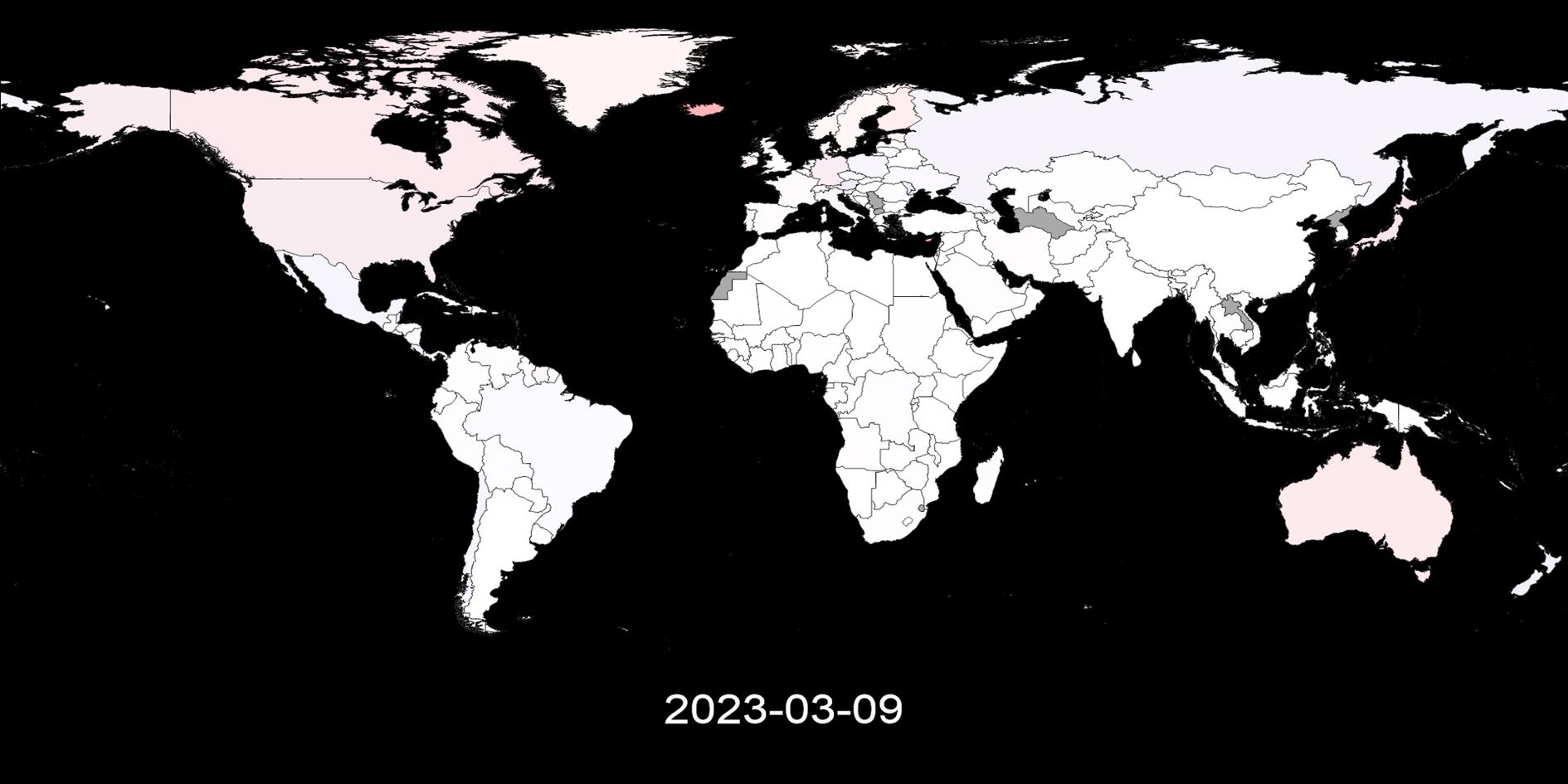
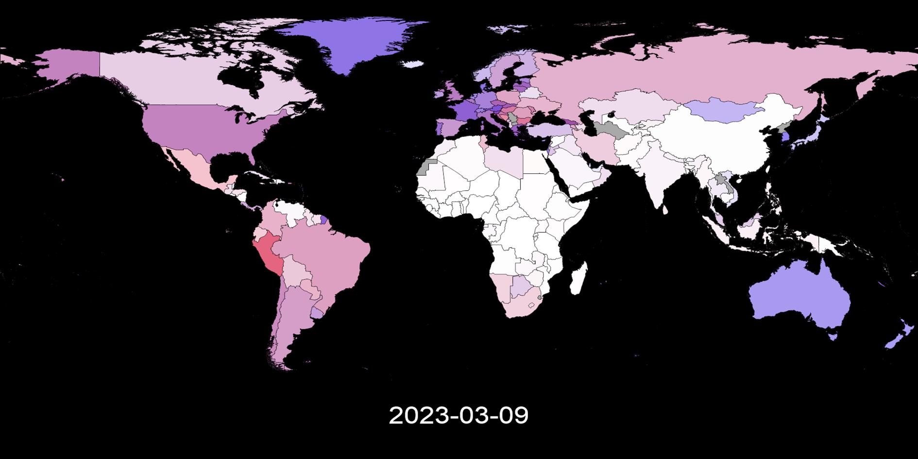
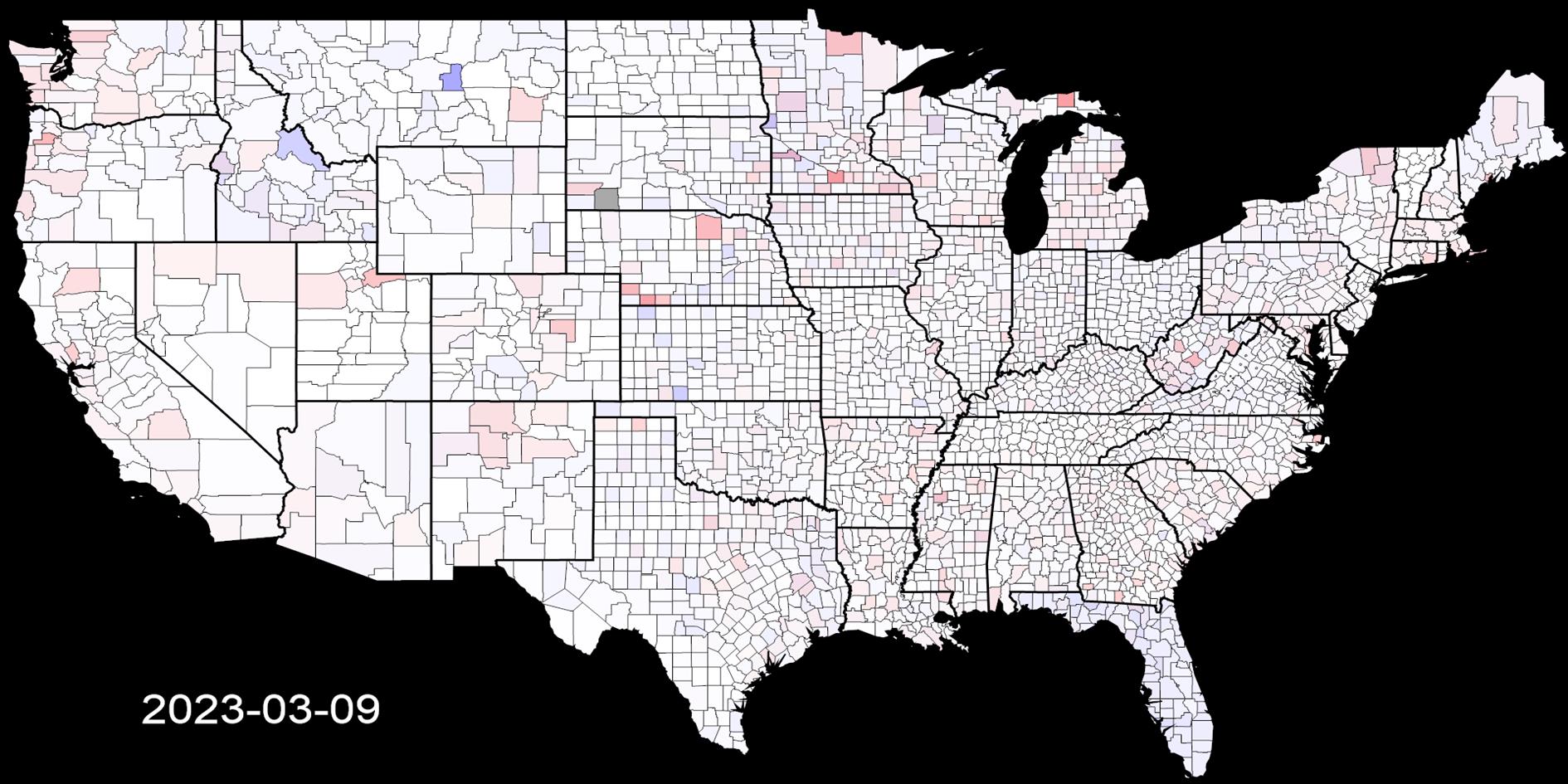
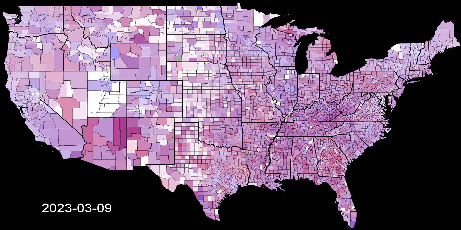
Visualizing Coronavirus Cases and Deaths by Country and US County #etc#coronavirus#shapefile#h5v Videos showing the spread of confirmed COVID-19 cases and death by country and US county/state per capita from 2020 to 2023.
Updated on Saturday, September 23, 2023
Cases and Deaths by Country
Week on Week Incremental
Cumulative
Cases and Deaths by US County
Week on Week Incremental
Cumulative
This post visualizes global and US county level coronavirus data from
Johns Hopkins University. Four videos show both cumulative and week on week
progression (comparing seven day moving averages) of the disease together with four images that show the most recent snapshot. It used to be updated weekly, this stopped August 5, 2023.
Cases and deaths are shown simultaneously using blue for cases and red for deaths.
Where both are high a region will be a shade of purple. Regions with no data are dark gray.
The week on week incremental visualization is useful to see the history and current state of the spread of coronavirus.
Each region is shaded based on the highest number of daily cases and deaths for that region and is relative to population. For example if the highest
number of deaths reported on any day in San Francisco county is seven, then any day that has seven deaths will be the
brightest shade of red. This shows where COVID-19 is relatively bad over time.
The cumulative visualization is shaded relative to the highest total death and case count for any region, relative to population.
As the location and date of the peak in week on week and cumulative cases and deaths change over time the videos will be
different each time you watch. Bookmark this post and check back for weekly updates.
(This is the fifth version of this post as I have changed the data source and methodology several times.
I usually preserve the previous version of any post but the changes are large enough that in this case I have removed them).
(Published to the Fediverse as:
Visualizing Coronavirus Cases and Deaths by Country and US County #etc#coronavirus#shapefile#h5v Videos showing the spread of confirmed COVID-19 cases and death by country and US county/state per capita from 2020 to 2023.)
I’ve just released a small update to Catfood.Shapefile. Stephan Stapel, who implemented PolyLineM support, has contributed a patch that improves the class hierarchy. CodePlex user originSH suggested supporting the ACE driver for 64-bit systems. I’ve added a constructor overload that allows you to use predefined Jet and ACE connection strings or provide your own templates if necessary. Thanks to Stephan and originSH.
Catfood.Shapefile is a .NET library for enumerating ESRI shapefiles. I originally wrote the library to help me build some complex layers in Catfood Earth. Since then it’s picked up thousands of users and some really valuable suggestions and patches from the CodePlex community. I’m very glad a took a couple of hours to open source the library back in 2009.
I’ve just updated Catfood.Shapefile, my ESRI Shapefile parser for .NET, with PolyLineM support thanks to a contribution from Stephan Stapel. The solution for the new version has also been updated to Visual Studio 2010.
I've just released a small update for my ESRI Shapefile Reader project on GitHub. The only change is a patch from SolutionMania that fixes a problem when the shapefile name is also a reserved name in the metadata database. The patch escapes the name preventing an exception from being thrown.
Catfood.Shapefile.dll is a .NET 2.0 forward only parser for reading an ESRI Shapefile. Download 1.20 from GitHub.
I've just released v1.10 of my ESRI Shapefile Reader (Catfood.Shapefile.dll). This is a .NET 2.0 forward only parser for reading shapefile content.
Sharon Tickell was kind enough to report two bugs with suggested updates. These have both been fixed in 1.10.
While working on these fixes I also discovered that there are no 64-bit Jet drivers (since releasing the first version I've upgraded to a 64-bit box for development). This is an easy fix, just target any application using Catfood.Shapefile.dll at x86. I've updated the demo application accordingly.
Catfood.Shapefile is a .NET read-only, forward-only parser for Esri shapefiles. With Catfood.Shapefile it’s easy to enumerate all the shapes in a shapefile together with their metadata.
From version 2.00 Catfood.Shapefile is available via NuGet. It has also been migrated to .NET Standard 2.0. This means it is compatible with .NET Framework 4.61 or better and .NET Core 2.0 or better. If you use an older version of .NET then you should continue using Catfood.Shapefile 1.60. The source code is on GitHub.
Esri (originally Environmental Systems Research Institute) shapefiles are a GIS (geographic information systems) file format that can store a wide variety of geographic information. I originally started working with these files to add country borders to Catfood Earth.
Shapefiles actually consist of a number of different files with different extensions. There are three mandatory extensions: .shp, .shx and .dbf and so a shapefile containing borders might be distributed as borders.shp, borders.shx and borders.dbf. The .shp file contains the actual shape data in vector format, often lines or polygons. The .shx file is an index to the shapes. Finally the .dbf file is a database of metadata associated with the shapes. Catfood.Shapefile requires these three files.
There are several optional extensions that might be included with a shapefile. .prj contains the geographical projection, .xml is an alternate metadata format, .sbn and .sbx index for spatial queries, and .cpg defines the code page used by the shapefile.
Here is some sample code for a .NET 6 console application to print basic information about a shapefile and the first point in the first polygon:
To use this, create a new console application, paste the code into Program.cs and add Catfood.Shapefile via NuGet.
The default constructor uses a database connection string that uses the Jet driver. This is only available for 32-bit applications and you will need to target Windows x86 to use it. An overload is available that allows you to specify a custom connection string to access metadata.
Catfood.Shapefile supports Null, Point, MultiPoint, PolyLine, PolyLineM and Polygon shapes. Three dimensional shapes (PointZ, PolyLineZ and PolygonZ) are not currently supported. There is also currently no support for writing shapefiles. If you add any of this please send a pull request on GitHub!
I am grateful to the developers who have contributed to Catfood.Shapefile over the years. Most are credited in the release notes below. If you need help or have feedback please leave a comment on this post.
I just released Catfood.Shapefile 2.00, my .NET parser for ESRI Shapefiles.
The big change is that I have migrated to .NET Standard 2.0. This makes it possible to use from .NET Core as well as classic .NET Framework from 4.6.1 up. If you need to use an older version of .NET Framework then you'll want to stick with Catfood.Shapefile 1.60.
Catfood.Shapefile is now also available via NuGet. This is the recommended way to install. The source code is still available on GitHub.
Catfood.Shapefile 1.60
I just released Catfood.Shapefile 1.60. This contains a fix from Libor Weigl that factors out the enumerator so that you can still access the shapefile after enumeration.
Catfood.Shapefile is a .NET library for parsing ESRI Shapefiles.
A few people have asked for 3D shape support in my ESRI Shapefile library. I've never got around to it, but CodePlex user ekleiman has forked a version in his ESRI Shapefile to Image Convertor that supports PointZ, PolygonZ and PolyLineZ shapes. If that's what you need please check it out.
Catfood.Shapefile 1.50
I've just released a small update to my C# Shapefile library on Codeplex. Catfood.Shapefile 1.50 fixes a couple of bugs related to metadata and adds the ability to access metadata records directly via IDataRecord.
Catfood.Shapefile 1.40
I’ve just released a small update to Catfood.Shapefile. Stephan Stapel, who implemented PolyLineM support, has contributed a patch that improves the class hierarchy. CodePlex user originSH suggested supporting the ACE driver for 64-bit systems. I’ve added a constructor overload that allows you to use predefined Jet and ACE connection strings or provide your own templates if necessary. Thanks to Stephan and originSH.
Catfood.Shapefile is a .NET library for enumerating ESRI shapefiles. I originally wrote the library to help me build some complex layers in Catfood Earth. Since then it’s picked up thousands of users and some really valuable suggestions and patches from the CodePlex community. I’m very glad a took a couple of hours to open source the library back in 2009.
PolyLineM support in Catfood.Shapefile
I’ve just updated Catfood.Shapefile, my ESRI Shapefile parser for .NET, with PolyLineM support thanks to a contribution from Stephan Stapel. The solution for the new version has also been updated to Visual Studio 2010.
I've just released a small update for my ESRI Shapefile Reader project on GitHub. The only change is a patch from SolutionMania that fixes a problem when the shapefile name is also a reserved name in the metadata database. The patch escapes the name preventing an exception from being thrown.
Catfood.Shapefile.dll is a .NET 2.0 forward only parser for reading an ESRI Shapefile. Download 1.20 from GitHub.
Catfood.Shapefile.dll 1.10
I've just released v1.10 of my ESRI Shapefile Reader (Catfood.Shapefile.dll). This is a .NET 2.0 forward only parser for reading shapefile content.
Sharon Tickell was kind enough to report two bugs with suggested updates. These have both been fixed in 1.10.
While working on these fixes I also discovered that there are no 64-bit Jet drivers (since releasing the first version I've upgraded to a 64-bit box for development). This is an easy fix, just target any application using Catfood.Shapefile.dll at x86. I've updated the demo application accordingly.