Due mainly to Coronavirus I haven't been back to the UK in four years. This time I have three profound changes to report.
The first is that almost every single tourist attraction is selling tickets in 15 minute increments. I'm sure this is pandemic related and maybe it will eventually go away. I'm also used to buying in advance to save some money (sound marketing so I don't get distracted and do something else). I'm also used to everything being part of a network of that place and 100 other places you're not going to visit, so you're constantly being seduced by an English Heritage membership but the next place you go will be British Legacy and then Angligan Birthright and so on until you have no more money.
The problem with 15 minutes is that it's a hard window to hit and so you end up arriving an hour early and then being bored waiting for your slot. And then if you have the temerity to try and do two things in one day, when do you book the next one for? You're either not doing justice to the first one or you're early again and bored waiting twice in one day. And it's not like your 15 minute window isn't shared with 1,000,000 other people who are coughing and not wearing a mask. This made everything 10% less pleasant.
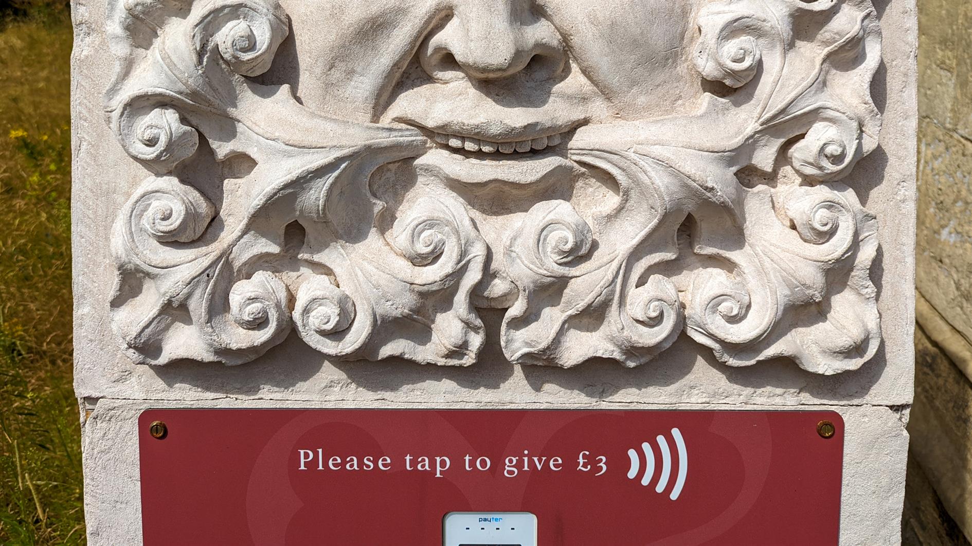
Second up, and maybe also a pandemic thing, all payments are now contactless. Buskers have contactless terminals. Random statues do. Ice cream vans invite you to tap and pay and hope it's configured for £2 and not £2000. Usually one of the first things I need to do in the UK is hunt down a cash machine. This trip I think I only needed cash once. I love it.
Finally, people can't drive any more. Actually my theory is that they never could but a simple change has revealed something profound about motorway (freeway) behavior. I've always had a smug sense that British people drive better than Americans because when working properly a British motorway is a ballet of people overtaking and then moving over whereas an American Freeway is usually people picking a random lane and speed and sticking with it. However, motorways are usually 3 lanes and freeways usually somewhere between 4 and 500. Something magical happens between 3 and 4. With 3 lanes you're always going to have someone overtaking a truck, and then someone else overtaking that truck overtaker and the whole system is going to break down without some consideration. With 4 lanes this no longer holds true and people stop caring about each other. The UK has now widely installed 4 lane 'smart' motorways and chaos has ensued. They should go back to 3 lanes and the US should follow suit.
In case you have never encountered a smart motorway it's a regular one with the shoulder/breakdown lane converted into a traffic lane and a series of signs that say 'slow down', 'seriously slow down something has happened', 'you're going to die a horrible death if you ignore this' and then finally 'never mind, sorry'. What you actually need is 3 lanes, some attention to other people and Google Maps to show you when and where there is an actual problem with traffic.
This is a longer than usual installment of my culture shock on occasionally visiting the UK after having lived in San Francisco for over twenty years. See sweeteners and the Marks & Spencer crisis for more.
(Published to the Fediverse as:
15 minutes of terror, or how the UK has changed in four years #etc#uk#coronavirus#motorway Contactless payments, 15 minute admission windows, and worse driving - how the UK has changed in the last four years (2022 edition).)
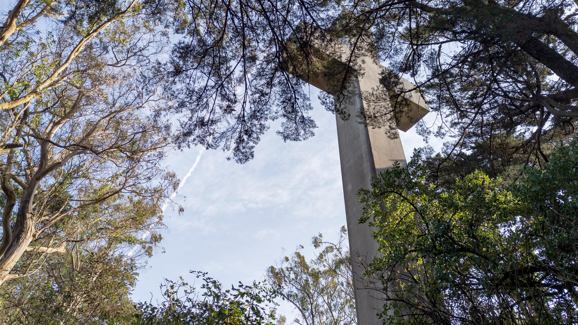
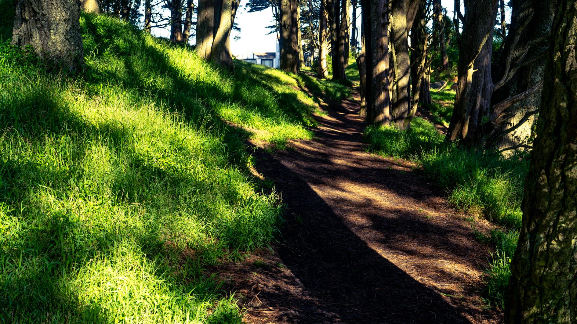
Continuing myseries of local coronavirus hikes, Mount Davidson is the highest peak in San Francisco and this three mile hike takes you there from West Portal. Take Ulloa to Kensington and then cross Portola on the footbridge. Juanita takes you to one of the Mount Davidson trails and up to the top. You can come back the same way, or follow Kensington all the way over to Taraval.
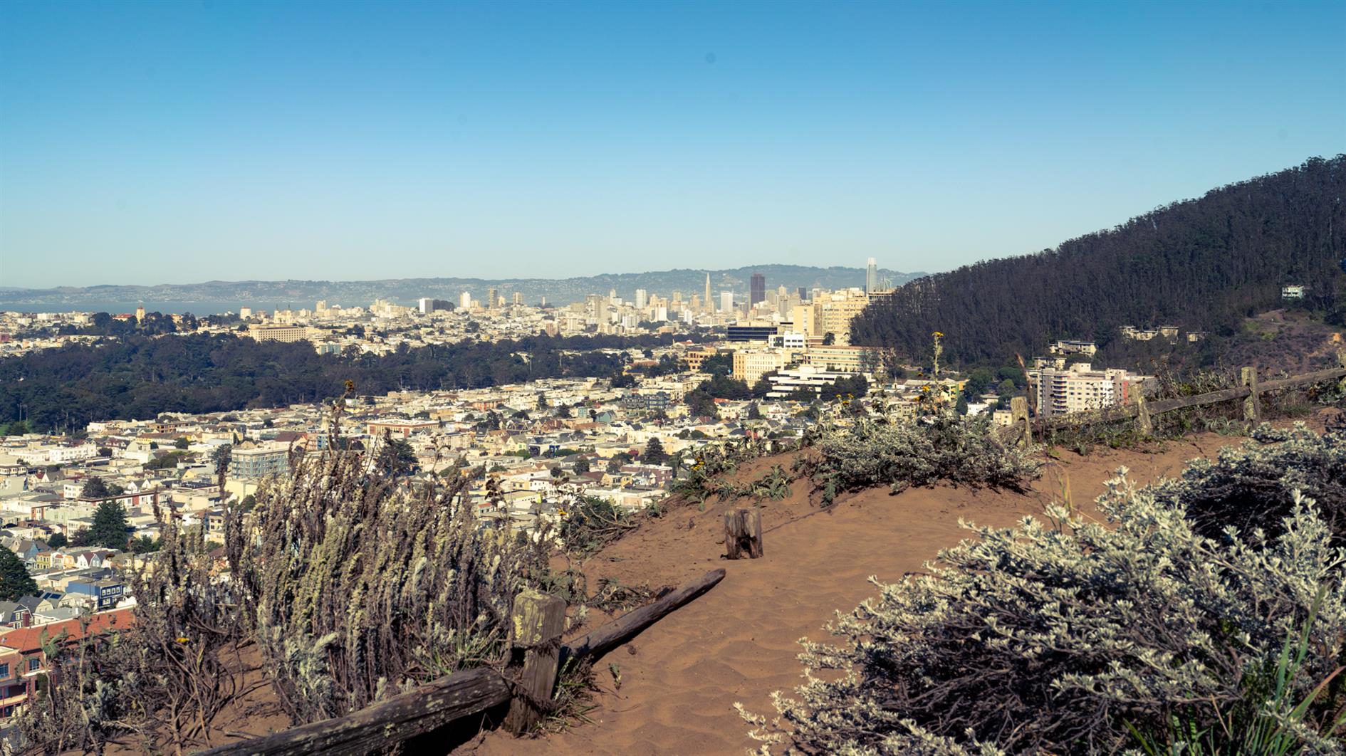
The cross at the top is a memorial to the Armenian Genocide and while most of Mount Davidson is a San Francisco park the area at the top is owned by the Council of Armenian-American Organizations of Northern California (due to a church/state separation lawsuit). It's a great spot to look (slightly) down on the Twin Peaks set who just think they've reached the top of San Francisco.
By Robert Ellison. Updated on Saturday, February 12, 2022.
San Francisco is apparently going to hell with criminals free to do as they please with no fear of consequences. I decided to take a look at the data.
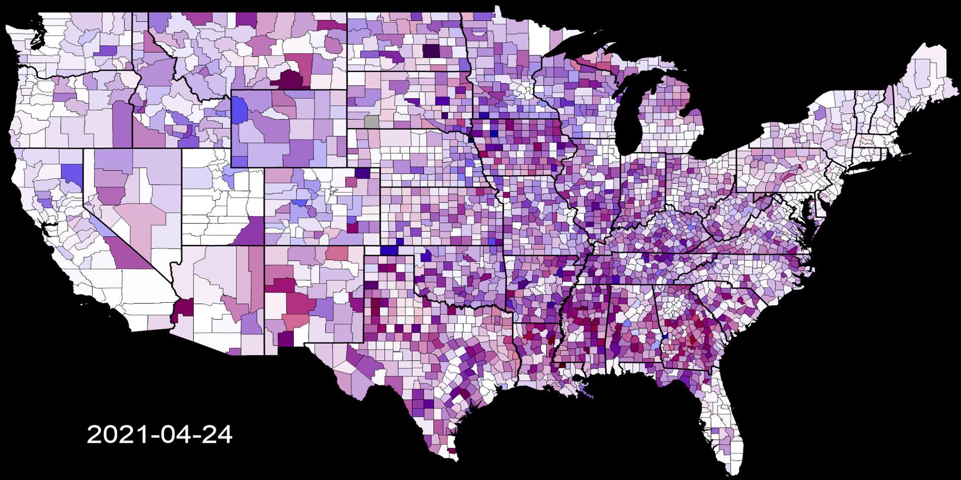
The video above shows a timelapse of SFPD incidents from 2003 through yesterday. Each frame is a day and shows incidents from the previous seven days. The top left corner of the video shows the date and the seven day count of incidents.
I grouped the reported categories into a few colors. Red is used for murder and rape. Orange for arson and kidnapping. Yellow for thefts and assaults. Purple for sex and drugs. Grey for anything else. I excluded some categories from the data (recovered vehicle, traffic collision, case closure and non-criminal).
SFPD reports the location of incidents as the closest intersection. To keep everything visible I move the location randomly within a tenth of a mile where there is a specific location reported. For crimes without a location I use a random spot within half a mile of the center of the police district (or the center of San Francisco if the district is missing - this is unusual).
The volume of incidents changes a bit during the ~18 years shown in the video, but the only real outlier is the dip following the start of the coronavirus pandemic in March 2000. Crime picks back up after this but so far hasn't returned to the level it was at before the pandemic.
(Published to the Fediverse as:
San Francisco Crime 2003 to 2021 #timelapse#sanfrancisco#crime#datalapse#coronavirus#video Timelapse video animation showing crimes in San Francisco color coded by category from 2003 to 2021 using SFPD incident reports from SFData.gov.)
By Robert Ellison. Updated on Thursday, August 10, 2023.
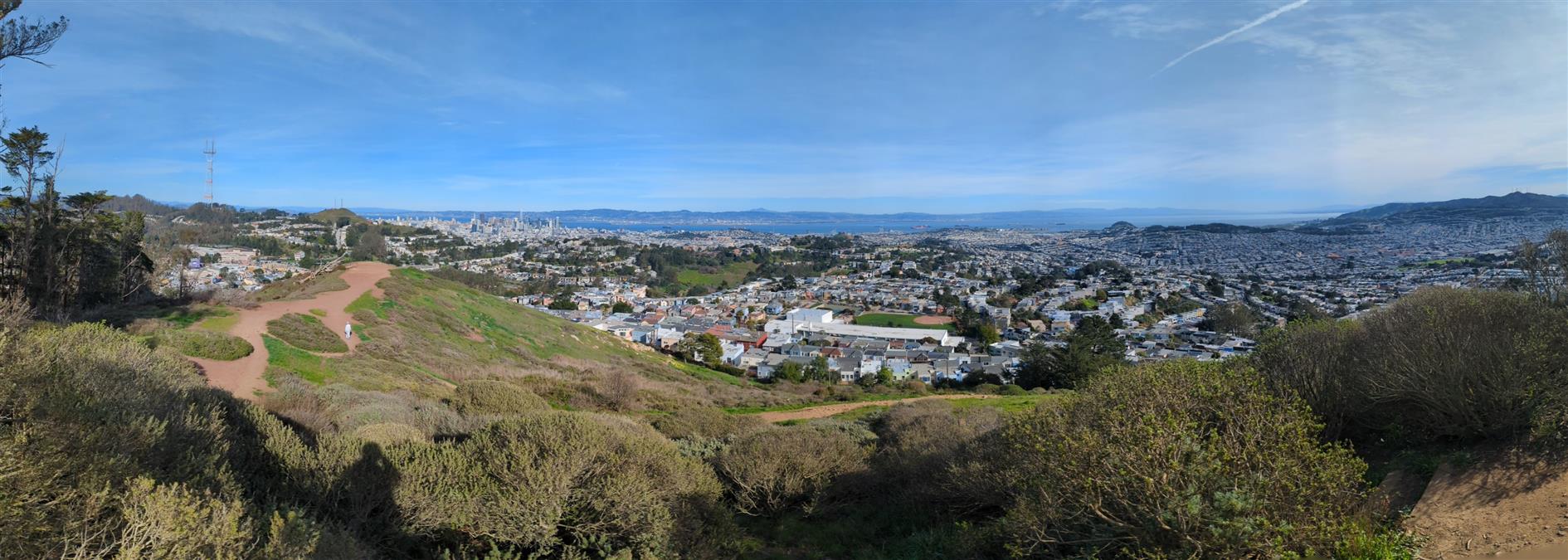
I have previously described Twin Peaks as not much of a hike, which is absolutely true if you drive there. When I first moved to San Francisco I lived in Noe Valley and used to cycle up to Twin Peaks and then try to get home without pedalling. For many years after that I'd take visitors up to the top and developed a somewhat weird tradition of taking each new child there soon after they were released from the hospital.
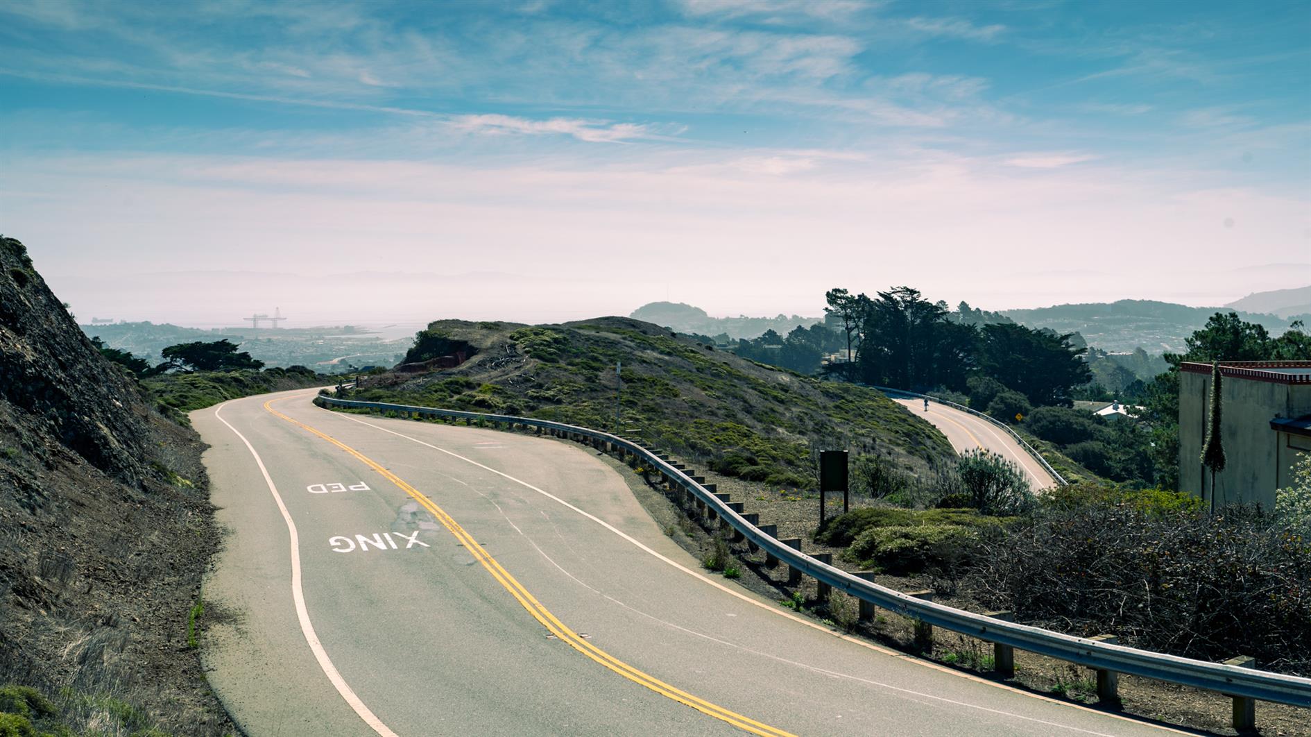
Post lockdown I'm up there most weeks. This is my five mile loop which starts heading up Ulloa from West Portal to Portola. Portola breaks the climb briefly as you pass the striking herchurch and controversial Twin Peaks gas station before heading up Twin Peaks Boulevard to the 922 foot summits. For a while Twin Peaks Boulevard was entirely closed to traffic (although you really had to keep an eye out for high speed skateboarders). Unfortunately it's now open all the way to Christmas Tree Point. Head down the north side to Clarendon and follow this all the way down to Forest Hill and then back to West Portal.
During the pandemic induced lockdowns last year we started hiking locally using random trails generated by Routeshuffle. Sometimes these were repetitive death marches along indistinguishable avenues (my kids would say 100% of the time). A few have emerged as favorites that I walk regularly and I'm going to add these to the ITHCWY hike collection.
Remnants in the Sunset is a three mile loop named for the islands of rock and dunes visited along the way. The west of San Francisco used to be all dunes and these parks are now all that remains of that original ecosystem.
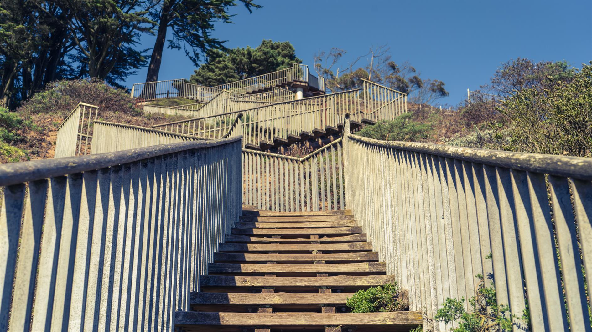
Walk up 15th Avenue from Taraval to Grandview Park. Go up the steps, admire the view and then down the other side and follow 14th Avenue to Rocky Outcrop Park. This is a wind tunnel with houses on one side and cliffs on the other. Then head up to Golden Gate Heights Park and Larsen Peak at 755 feet. The return leg down Pacheco and Magellan provides views of Hawk Hill which has some unofficial trails but is closed to the public.
(Published to the Fediverse as:
Remnants in the Sunset #hike#sanfrancisco#coronavirus#map Three mile loop hike visiting the Remnants in the Sunset: Grandview Park, Rocky Outcrop Park, Golden Gate Heights Park and Hawk Hill in San Francisco, California.)
As a public service we interviewed every coronavirus expert from every hospital and public health department to get definitive advice on how to think about COVID-19 and navigating the current state of the pandemic.
ITHCWY: With the rise of the more infectious Delta variant, how should the vaccinated approach returning to bars, restaurants and even the office?
ECE: Great question. I think people should be asking themselves two questions. First, how vulnerable are you to infection? Do you have comorbidities brought on by having been alive for more than a few years? Do your cells accept or reject spike proteins? Second, what is your personal tolerance for badly quantified risks?
ITHCWY: What about families where the parents are vaccinated but there might be younger kids who aren't eligible?
ECE: Families are in a tough spot. As well as considering your own unknown vulnerability and appetite for risk, parents should also consider how likely their children are to get infected and the various articles they have read about unprecedented increases in vanishingly rare side effects that are overwhelming health providers at unconcerning levels.
ITHCWY: Your education and career have prepared you to quantify absolute and relative risks for infectious diseases, correct?
ECE: That's right. Not sure why you'd be interviewing me otherwise.
ITHCWY: Let's move on to outdoor risk. Last year there was a lot of talk of maintaining six feet of separation. Is this still the best advice?
ECE: It was the best advice we had available at the time. It turns out that six feet came from a Japanese marketing campaign in the '60s and has been passed on from public health expert to public health expert until the origins were entirely forgotten. The Japanese character for 6 looks a lot like a man standing to one side while a virus particle lands harmlessly next to him and so it kind of stuck. Cute, but it turns out there is little data to suggest it should be 6 feet rather than 4 or 20.
ITHCWY: So in 2021 what sort of distance should we leave when passing others?
ECE: It's a heavily populated planet. If you're moving further away from one person you're getting close to another. Instead of absolute distance I'd consider if that total stranger is vaccinated, what their hygiene habits are like, do they look like they'd cough into their elbow or directly at your face. That kind of thing. And as always you should consider your likelihood of infection from that specific person as well as the risks you've already taken and may yet take that day.
ITHCWY: More and more businesses are installing carbon dioxide sensors. Do you think this is a helpful trend?
ECE: As we all know ventilation is incredibly important in an indoor environment. It's also important that we use common sense. If you think 400 parts per million is a good level of CO2, good for you. If your spider sense thinks it should be more like 20%, knock yourself out.
ITHCWY: Is there a level of CO2 that would make you, for instance, stand up and leave a restaurant and go somewhere else?
ECE: Yes.
ITHCWY: Thanks for your time today. I'm sure our readers feel that all of their questions have been cleared up.
(Published to the Fediverse as:
Every Coronavirus Article #etc#coronavirus ITHCWY interviewed every coronavirus expert to provide the definitive advice on the state of the pandemic in 2021 so you can stop reading other articles.)
The daily version is now based on seven day moving averages. This helps with the rate at which different regions report statistics and makes the animation a but easier to follow. The shading is based on the difference between the average yesterday and the average for the previous day (i.e. today it's the increase from April 17 - 23 to April 18 - 24).
Population scaling is now different between the daily and cumulative versions. Daily frames are scaled to the worst recorded case and death increase for that region. Cumulative frames are scaled to the cumulative highest case and death levels, but each region is scaled by population so the highest level is on a per capita basis not an absolute total. For the US animation this uses 2019 estimates from the US Census Bureau. The global animation the figures are 2018 World Bank estimates.
Finally the frame rate for videos has increased to 24fps from 5fps.
(Published to the Fediverse as:
Coronavirus Visualization Update #etc#coronavirus ITHCWY coronavirus visualization now includes seven day moving average daily updates and population scaled (per-capita) cumulative videos showing the course of the pandemic.)
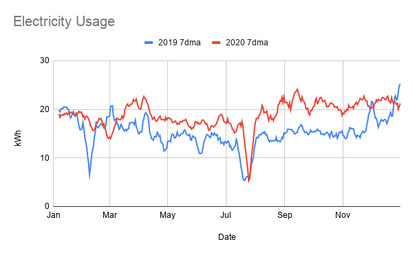
For no good reason I downloaded my gas and electricity consumption data by day for the last couple of years.
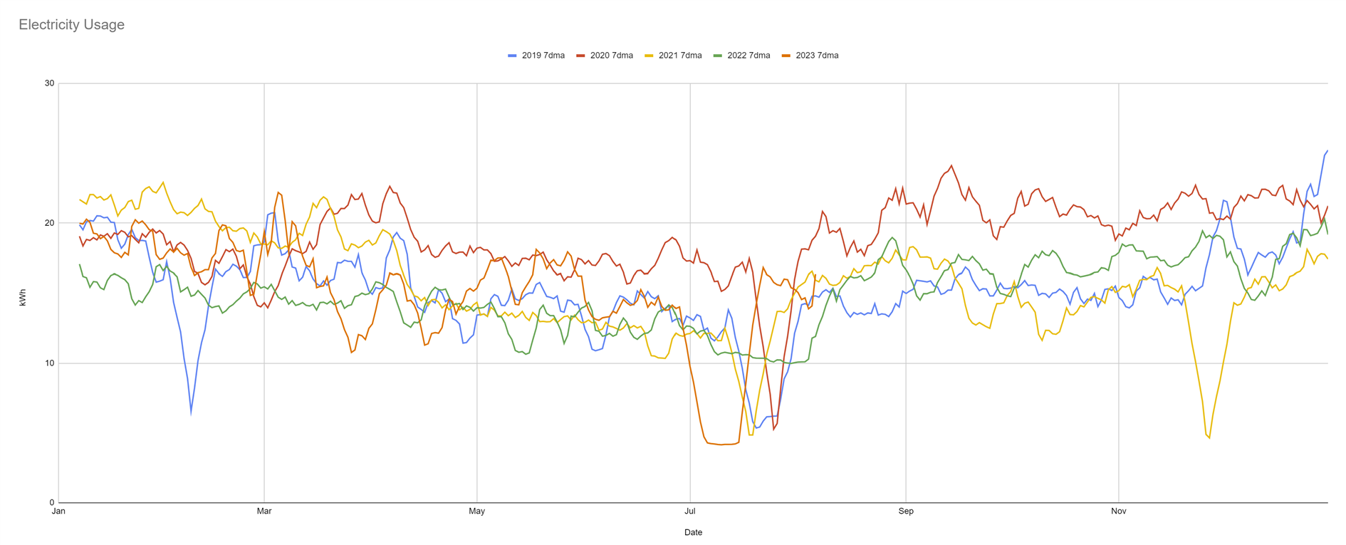
The electricity trend is unsurprising. At the start of the pandemic it jumps up and stays up. With work and school from home we're running four computers non-stop, burning lights and (the horror) printing things. Overall we used 24% more electricity in 2020.
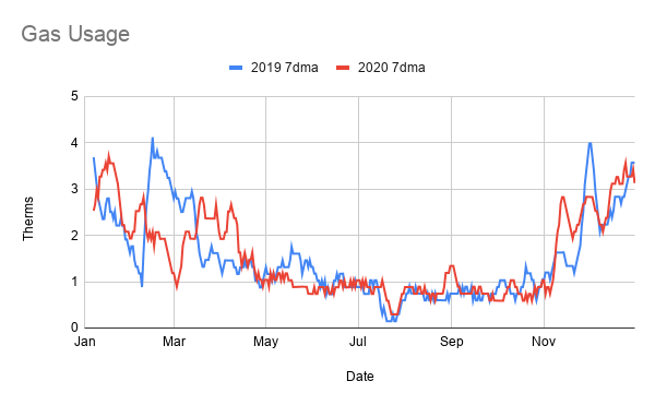
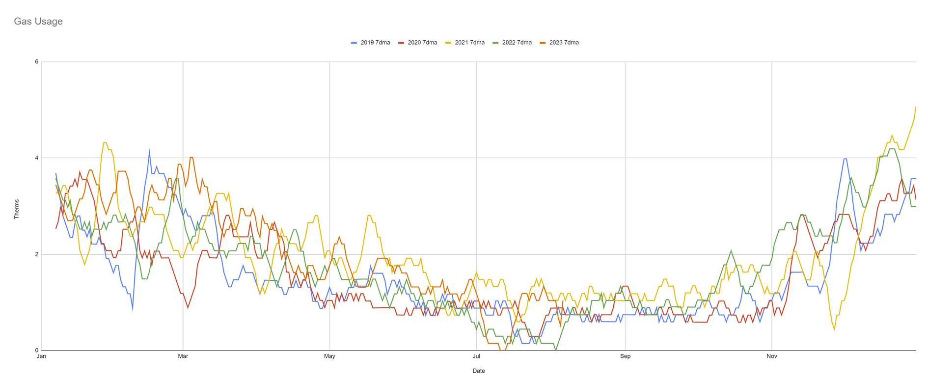
Gas on the other hand is pretty flat. There are some different peaks at the start and end of the year, but our total gas consumption increased by 0.08%. This doesn't make any sense to me. Being at home doesn't make much of a difference to laundry but it should have had a big impact on everything else. The heating has been on way more, we're cooking breakfasts and lunches that would have occurred out of the house in 2019 and we must be using more hot water as well.
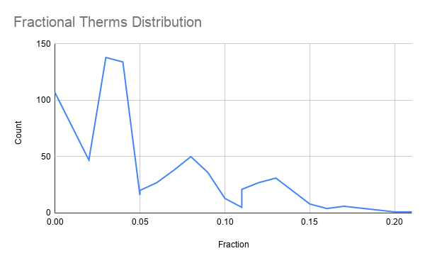
There is one strange difference between how electricity and gas are metered. Fractional kWh are distributed randomly between .00 and .99 as you'd expect. Fractional therms are totally different - we're apparently likely to use 1.02 or 2.03 therms but never 1.50. This feels like it must be some sort of rounding or other billing oddness but I can't find any reasonable explanation despite asking Google three different ways.
In a move that I might come to bitterly regret I have emailed PG&E to see if they can explain it. I'll update this post if I hear back. Or if you're a therm metering expert please leave a comment!
Updated 2021-02-20 13:51:
PG&E say:
"Thank you for contacting our Customer Service Center. Gas usage is registered by recording therms usage. If you view your daily usage online, you will see that therms are only registered in whole units. The only pace that you will see therms not as whole units is when you review the average daily usage. The pandemic started in March 2020 and since then your gas usage is up slightly versus previous years. Most customers will see a larger increase in electric usage versus gas usage when staying home more than normal. The majority of customers set the tempatures of the their heaters to very similar temperatures year over year and your heater will work to keep your house at the temperature whether you are home or not at home."
So the fractional therms are some sort of odd rounding on the downloaded data. Fair enough.
The majority of customers use the same temperature setting? Really? So that might be a good explanation if you constantly heat your house to the same temperature, but I know for sure that isn't us. We have a Nest Learning Thermostat and as I've previously reported this doesn't so much learn as just constantly turn the heating off. So staying warm is a constant battle with the thing.
Maybe the difference is that the pandemic started around Spring when San Francisco is warm enough to not need much heating. I'll look again when I can just compare winter vs winter in a couple of months.
Updated 2023-08-06 18:11:
Took a while to update, but here is some more data. Electricity stayed high until Spring 2021 and then dropped to roughly pre-pandemic levels. This is because I spent a lot of time in 2021 upgrading lighting. My house has a different type of fixture/bulb in every room making this a painful process but I'm almost 100% LED at this point which has made a difference. Gas on the other hand has got higher and stayed there and I should really replace some more windows and add some more insulation...
I really wish the utility companies made this data available through some useful API instead of needing to download the occasional CSV. I'd build a dashboard and obsess over energy usage far more.
(Published to the Fediverse as:
Pandemic Gas Mystery #etc#coronavirus#gas#electricity Why is my gas bill flat in 2020 when electricity usage has gone up 24%? A pandemic gas mystery based on PG&E data.)
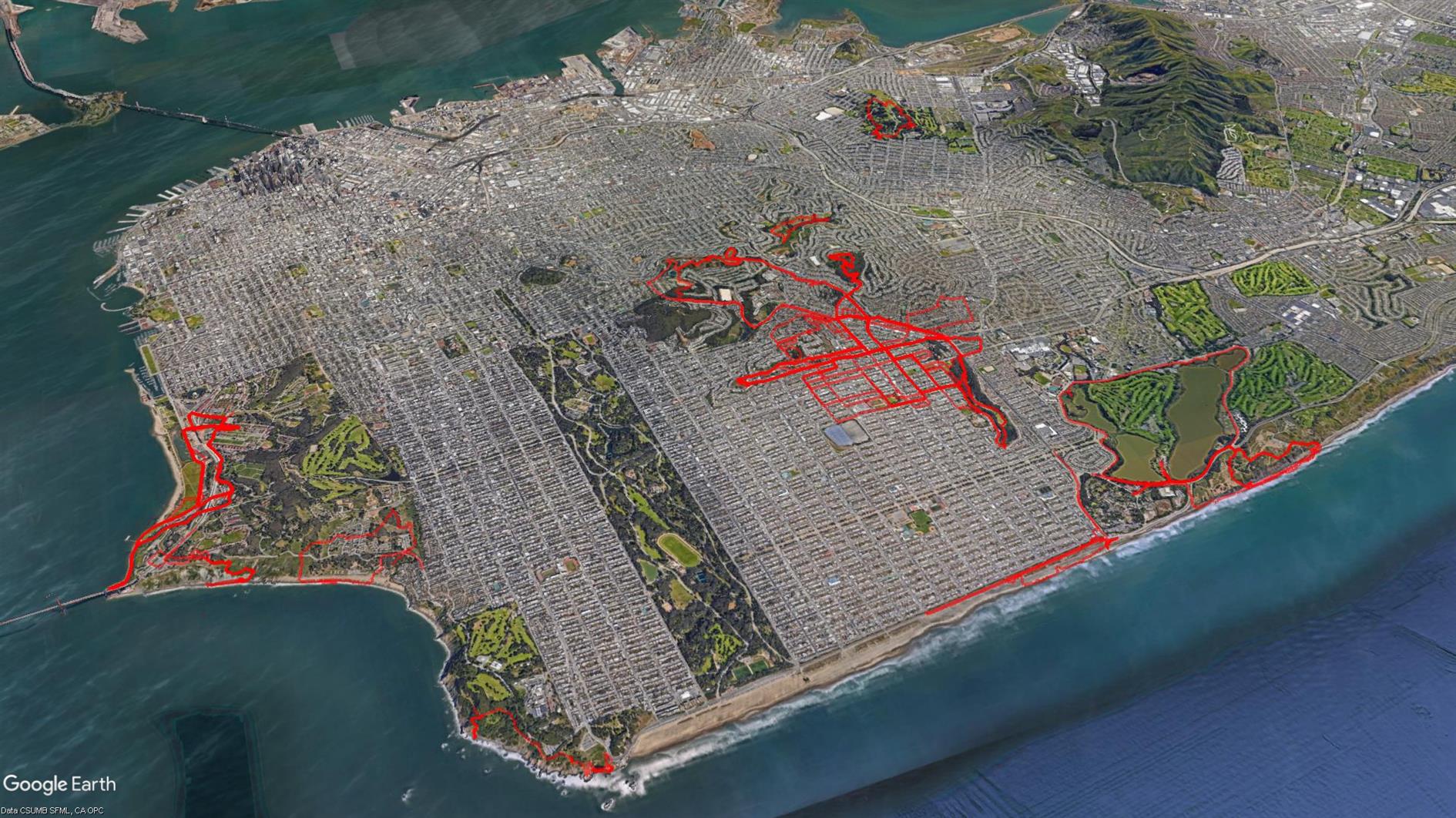
The Google Earth screenshot above is a composite of all of our Coronavirus hikes from March to October. We have thrashed the sidewalk around our neighborhood, discovered some new favorites and gone from hyper-local to a more normal regime. I'm not going to track these specifically any more and will return to blogging new hikes that you'd do even if not forced to by circumstances.
(Published to the Fediverse as:
Coronavirus Hikes: Done #hike#coronavirus Final map of many coronavirus hikes in and around our neighborhood. Have discovered some pretty good out of the front door routes.)