By Robert Ellison. Updated on Saturday, February 19, 2022.
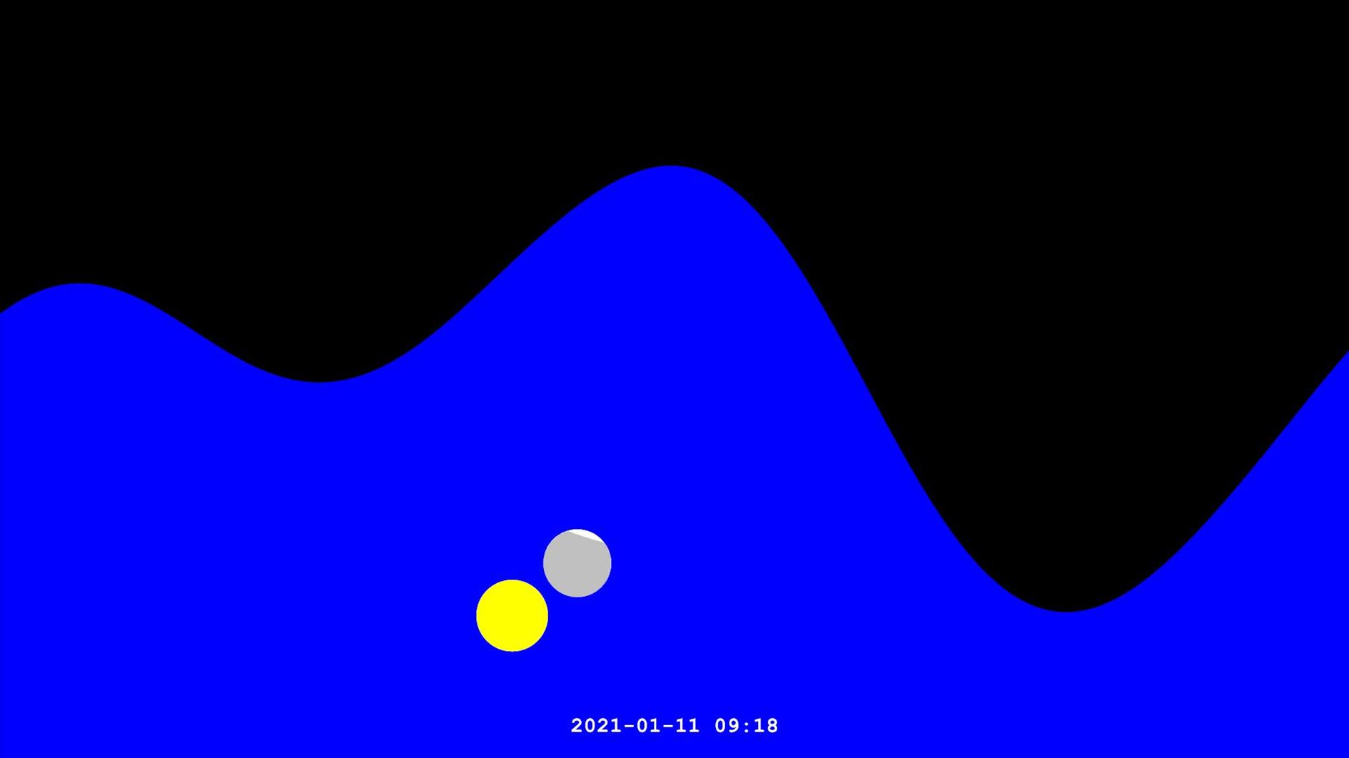
This animation shows a year of tides in San Francisco with the sun and moon:
I was inspired to create this after adding a tide forecast to a personal weather dashboard I have running on an old Surface Pro. I realized I didn't understand tides that much. I still don't, but I know more than I did before.
The animation illustrates four components of the tide. The obvious ones are the position of the sun and moon. When the moon is new or full the Earth, sun and moon are all lined up leading to larger 'spring' tides, which happen twice a month just like spring doesn't. As the moon waxes or wanes and becomes half full the moon and sun are at right angles and partially cancel each other out resulting in lower highs and higher lows. This is the neap tide, almost as unhelpful as 'spring'.
As orbits are not circles the Earth is closer or further away from the sun over the course of a year and the moon behaves the same way. When it's close than usual we get super moons and king tides (finally a type of tide that does what it sounds like). In the animation the sun and moon actually grow and shrink in proportion to their distance from Earth.
Here's how to read the animation. The date and time at the bottom of the screen refers to the tide right in the middle. The full screen shows the forecast running from 12 hours before the current time to 12 hours later. The vertical range is from -4 feet to 10 feet, relative to mean lower low water (MLLW), the average lowest tide over 19 years. The sun and moon are on a different scale - 360 degrees horizontally and 90 degrees vertically.
The tide forecast is pulled from the NOAA Tides and Currents API. I used SunCalc-Net for the position of the sun and moon, and the phase of and distance to the moon. For the distance to the sun I used a formula I found on StackExchange.
I wanted to both fit in a full year and run slowly enough to see what's going on each month so the video is around 20 minutes long. I won't be offended if you don't finish it.
(Published to the Fediverse as:
One Year of Tides Animated (with Sun and Moon) #etc#tides#sun#moon#sanfrancisco#video Animation showing four influences on the tide - the position of the sun and moon, and the distance of the sun and moon from the earth. Illustrates tide height and sun/moon position and distance as seen from San Francisco, California.)
(Published to the Fediverse as:
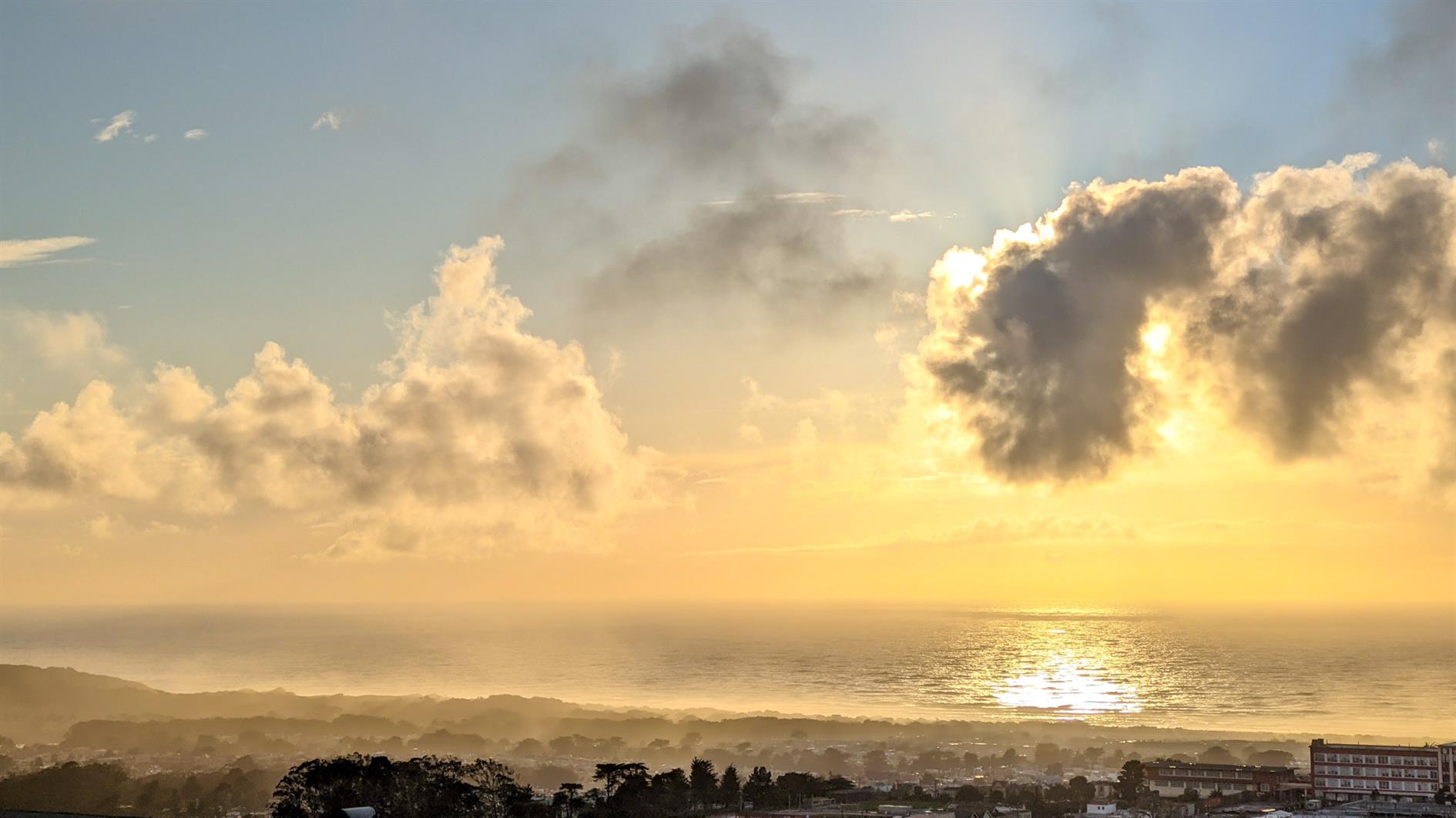
Post Storm Sunset #photo#sanfrancisco#sunset Photo of a dramatic sunset after a winter storm from Grand View park in San Francisco, California.)
(Published to the Fediverse as:
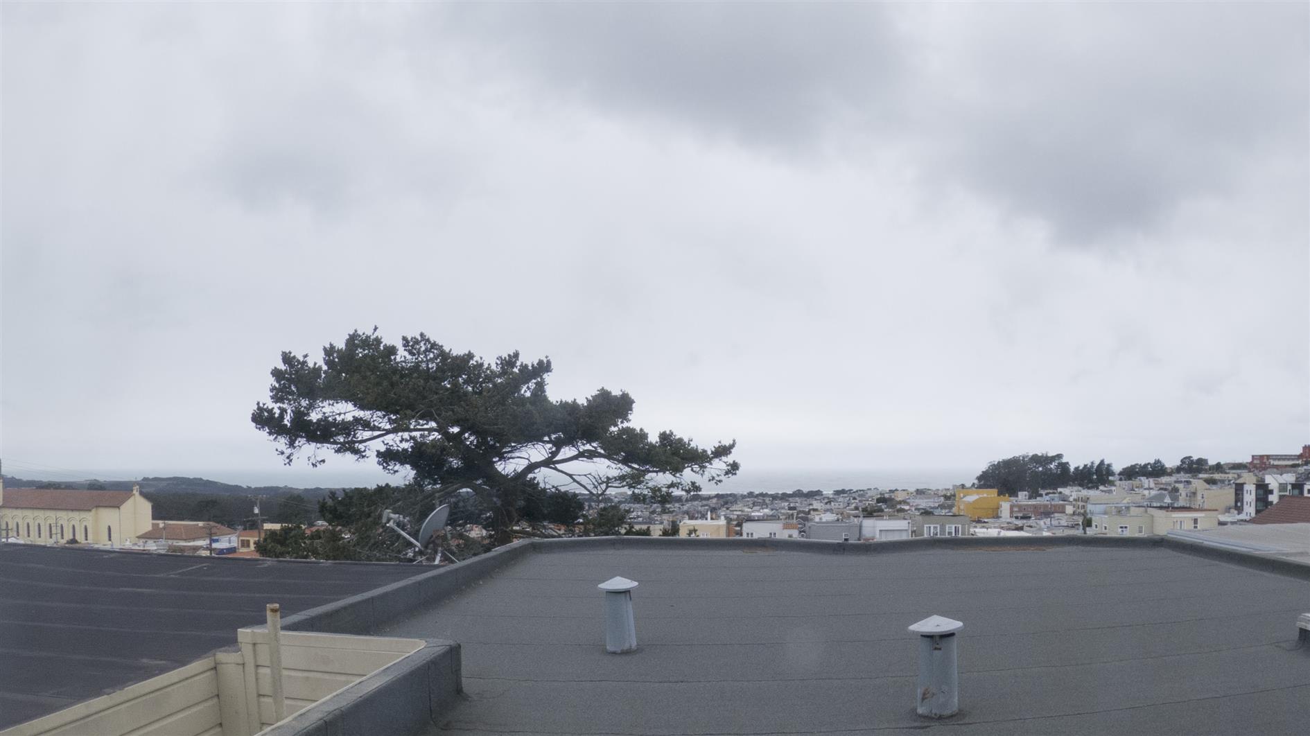
Stormy #timelapse#sanfrancisco#storm#video Time lapse of clouds developing and a storm sweeping in over the Sunset District in San Francisco, California.)
By Robert Ellison. Updated on Saturday, February 19, 2022.
A timelapse of San Francisco on New Year's Eve 2020:
Shot from Treasure Island, Corona Heights Park. Fort Baker and near Battery 129 in the Marin Headlands. Each sequence was transformed with a style transfer neural network (full details).
(Published to the Fediverse as:
San Francisco New Year's Eve Timelapse 2020 #timelapse#sanfrancisco#video San Francisco New Year's Eve Timelapse 2020 (style transfer neural network version).)
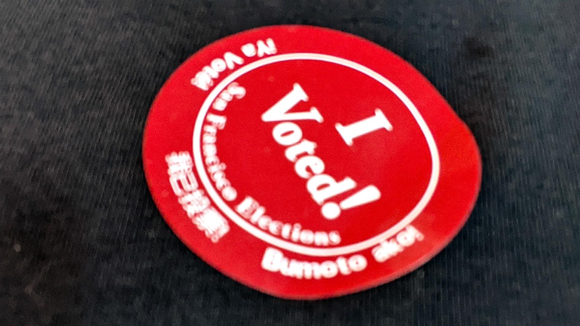
This is the first time I have voted by mail. In San Francisco there are clear instructions, a postage paid reply envelope and no need to get your ballot notarized or witnessed or other painful admin. The only real dilemma is the I Voted! sticker. When voting in person you just slap it on and wear it for the rest of the day. But when is the appropriate time for a postal vote? The instructions say:
"Show other San Franciscans you've voted to help encourage them to vote too!"
I get that, but it doesn't really speak to timing.
Is it a November 3rd thing to help with a final turnout push? When you actually fill it out? When you get round to dropping it in a mailbox?
Actually it's even more complex because there is a fancy ballot tracking system. So I get SMS notifications for when USPS has picked up the ballot, when San Francisco County has received it and finally when the ballot is accepted.
(Published to the Fediverse as:
I Voted! #politics#sanfrancisco#election If you vote by mail you still get an I Voted sticker but the etiquette on when to wear it is far from clear.)
I don't like to vote if I can't string together a rationale that I'm willing to post on my blog, so here are my recommendations for the San Francisco November 2020 ballot measures. It's been a tough year for the city. My neighbors are moving somewhere cheaper and less smoky, I see more houses on the market then usual as I walk around. It's hard to know what the next year will bring and to what extent tech jobs will end up shifting out of the bay area as the giants are forced to match work from home policies and smaller companies follow suit. What's clear to me is that we need to stimulate recovery and stop the city from becoming a worse place to live. And beyond that my ultimate dream of just throwing the politicians out if they're doing a lousy job rather than slogging through ballot measures for them. Until that day, here we go:
A: Health and Homelessness, Parks, and Streets Bond
Yes. The problem with homelessness is only getting worse and the construction will create jobs.
B: Department of Sanitation and Streets, Sanitation and Streets Commission, and Public Works Commission
Yes. The streets are a mess, so anything that shakes up the current system seems like it's worth a try.
C: Removing Citizenship Requirements for Members of City Bodies
Yes. Given the huge number of non-citizens paying taxes and otherwise contributing to the city it makes sense to allow them to participate in civic life. I don't support allowing non-citizens to vote but have no objection to them serving on a commission or other city body.
Yes. I really struggle with American policing. We have SF park rangers, community college police, university police, SFPD, sheriffs, highway patrol and other state police. That's without even starting to think about the various federal TLAs and transportation related agencies. Maybe before defunding the police we should first just spend a few years merging most of them and saving on administrative and uniform design costs? Having said all that I find it very hard to vote against more oversight for a department mainly concerned with running jails that organizes fight clubs at those jails. FFS.
Yes. I've never been in love with the payroll tax and moving to gross receipts with a higher exemption helps small business and startups. Seems like a good trade off.
Yes. I don't ride Caltrain often but I love it. My dream is coming back from a meeting on the peninsula in a comfortable top deck seat with a couple of cheap canned Gin and Tonics. We need more public transportation and we need it more than ever.
By Robert Ellison. Updated on Saturday, February 19, 2022.
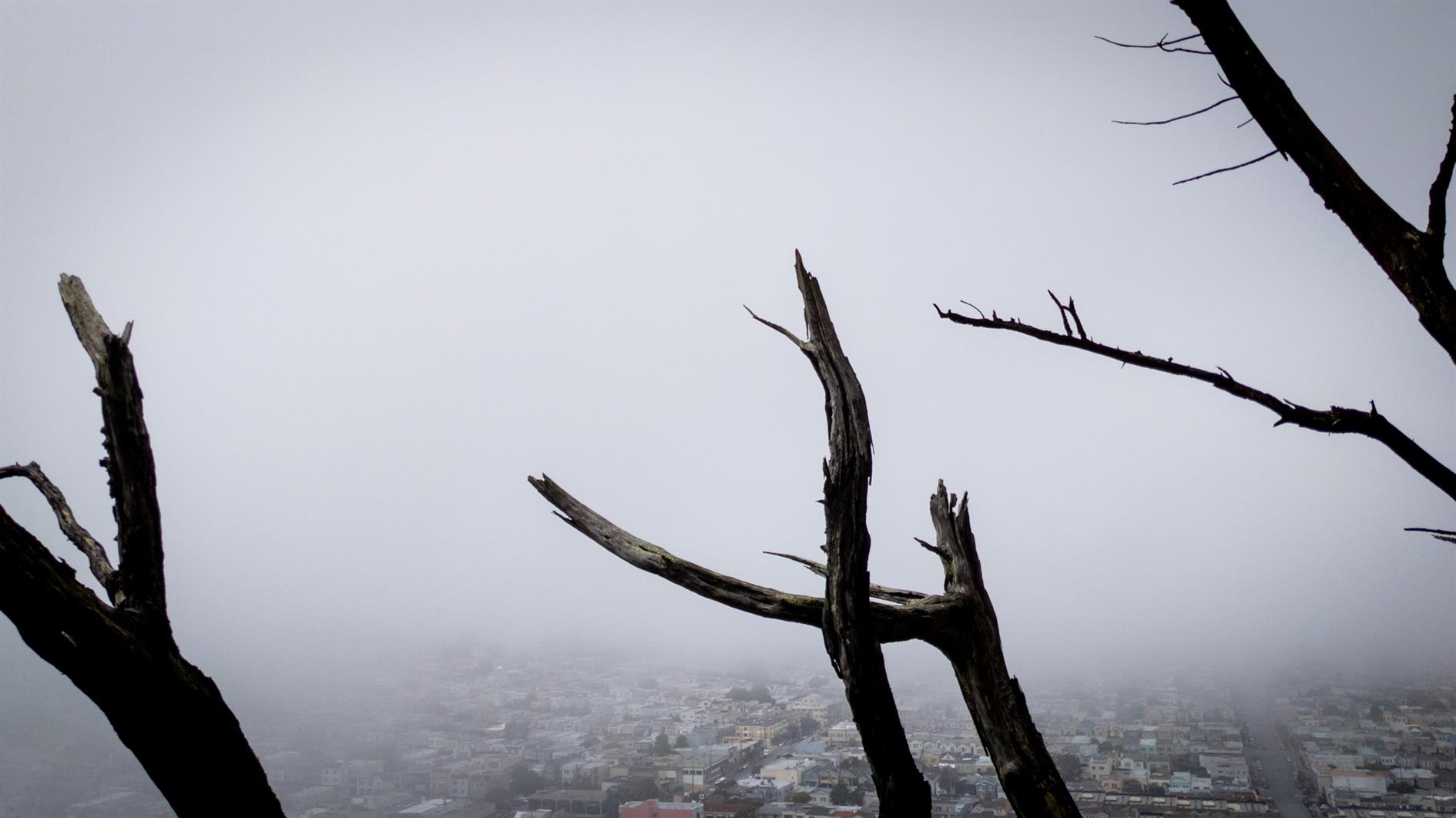
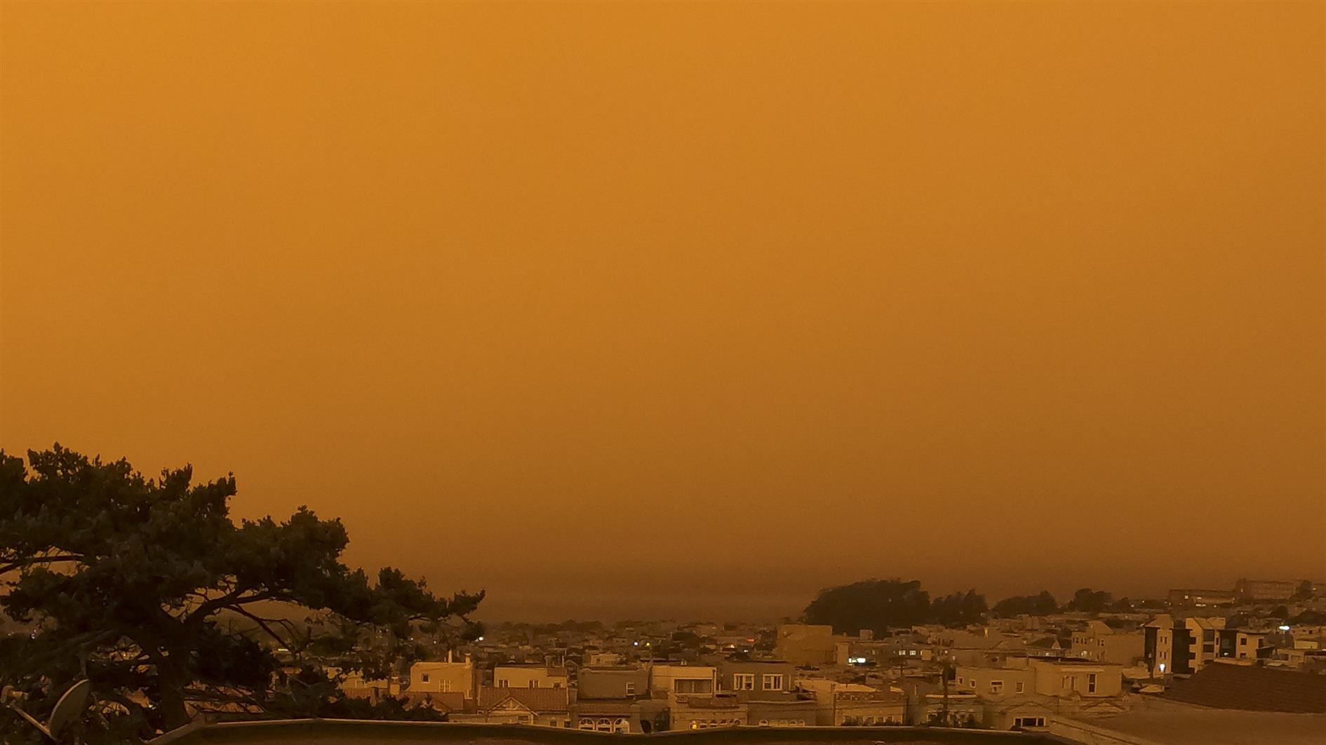
A timelapse combining the mid-August storm and the 'day without a sunrise' on September 9, 2020 in San Francisco (lightning from the storm contributed to the wildfires that blocked the sun).
(Published to the Fediverse as:
Cause and Effect, or Strange Skies over San Francisco #timelapse#sanfrancisco#video#smoke#storm Time lapse of the day without a sunrise in San Francisco and the storm that caused the fires that blocked the sun.)
By Robert Ellison. Updated on Saturday, November 18, 2023.
This doesn't work any more as Purple is charging for their API. Sorry.
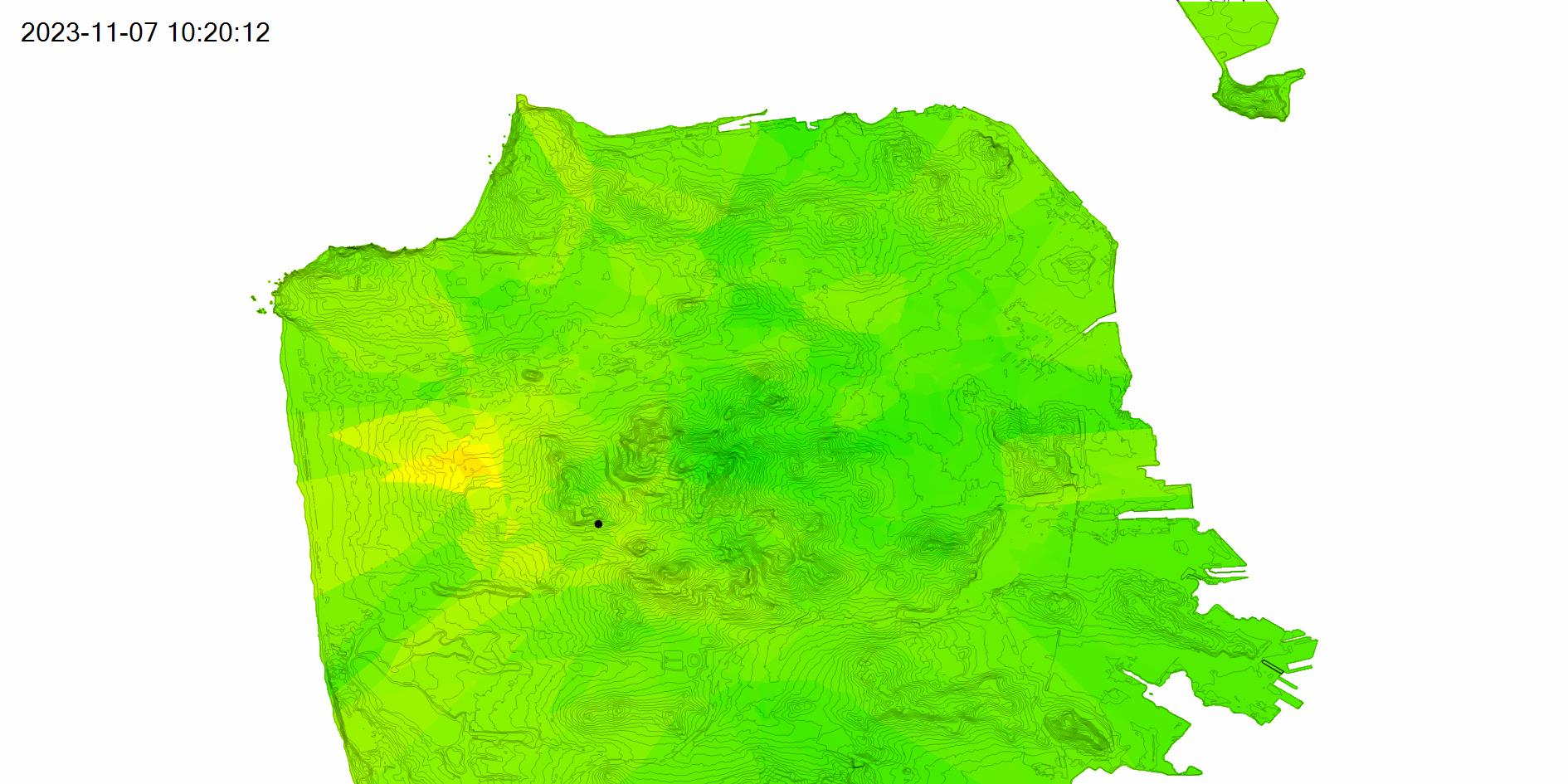
This post is updated hourly with a PM2.5 (2.5 micrometer or smaller particulate matter) map of San Francisco.
The video below shows the past 48 hours at six frames per second.
The PM2.5 data comes from the Purple Air API. The map uses one hour average readings from outdoor sensors and interpolates each point in San Francisco based on the inverse of the distance to the four closest sensors. The color scale is green to yellow (0-50), yellow to orange (50-100), orange to red (100-150) and red to purple (150-200+). San Francisco is plotted using elevation contours from DataSF.
Updated 2022-06-11 12:28:
The map is currently broken. The URL I use to download sensor data started returning a 500 error code at the end of may (Error: Server Error / The server encountered an error and could not complete your request. Please try again in 30 seconds.). This seemed like something Purple would need to fix. On closer inspection the error occurs after a redirect to https://purpleair-over-quota-2.appspot.com/ which sounds like too many requests (a 4xx error surely). With even more digging it turns out the download link is no longer supported (410 maybe then?) and so I'll need to migrate to the REST API to get this working again. I'm currently trying to get an API key and will get this fixed as soon as I can.
Updated 2022-06-13 17:28:
Purple Air were kind enough to issue me with an API key so the map is back to updating hourly.
Updated 2023-11-08 00:26:
And it's broken again. Purple have decided to start charging for their API. This is a shame, and I don't think I can pay for this just to keep this post running. I'm going to try moving to the AirNow system for some use cases, but it's not going to work for a detailed map of San Francisco as there is only one official sensor here.