Google search-for-your-own-verified-sites Console
By Robert Ellison.
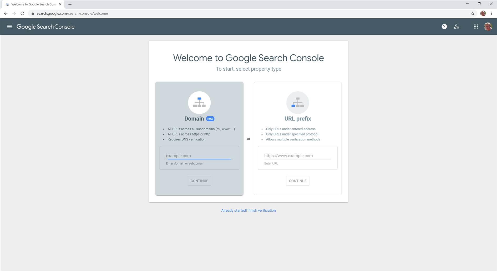
I don't know about you, but when it comes to Google Search Console I spend about 0.01% of the time adding sites and 99.99% analyzing existing ones. And yet when signing into Search Console with many verified sites the interface is ALL about adding a new one. Maybe 10% of the UX would be reasonable but it looks for all the world like I have nothing added.
To get to my sites I need to click the hamburger. Come on Google, being mobile first doesn't have to mean being desktop hostile.
Clicking the hamburger isn't even enough. This just brings up a practically blank sidebar. I then need to expand the 'Search property' drop down. Finally I get a needlessly scrolling list of my sites.
Add Comment
All comments are moderated. Your email address is used to display a Gravatar and optionally for notification of new comments and to sign up for the newsletter.