Did anyone tell Material Design about Gesture Navigation?
By Robert Ellison.
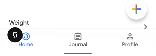
The screen shot above is from Google Fit. Which icon is active? I can't tell any more. Is it the blue one or the underlined one which is a much stronger cue?
Of course none of the icons are underlined. This is a bottom navigation bar on top of the Android navigation bar on Android 10 with gesture navigation enabled. My brain knows this but my finger still tries to click on Home. Journal just looks so much more active I can't help it. This friction is also in Google Photos and Google Maps and presumably Google everything before too long.
Maybe the Google app developers don't have access to recent Pixels, or maybe the Material Design team all have iPhones?

Add Comment
All comments are moderated. Your email address is used to display a Gravatar and optionally for notification of new comments and to sign up for the newsletter.