Global Temperature Anomalies Animation, 1850 to 2018
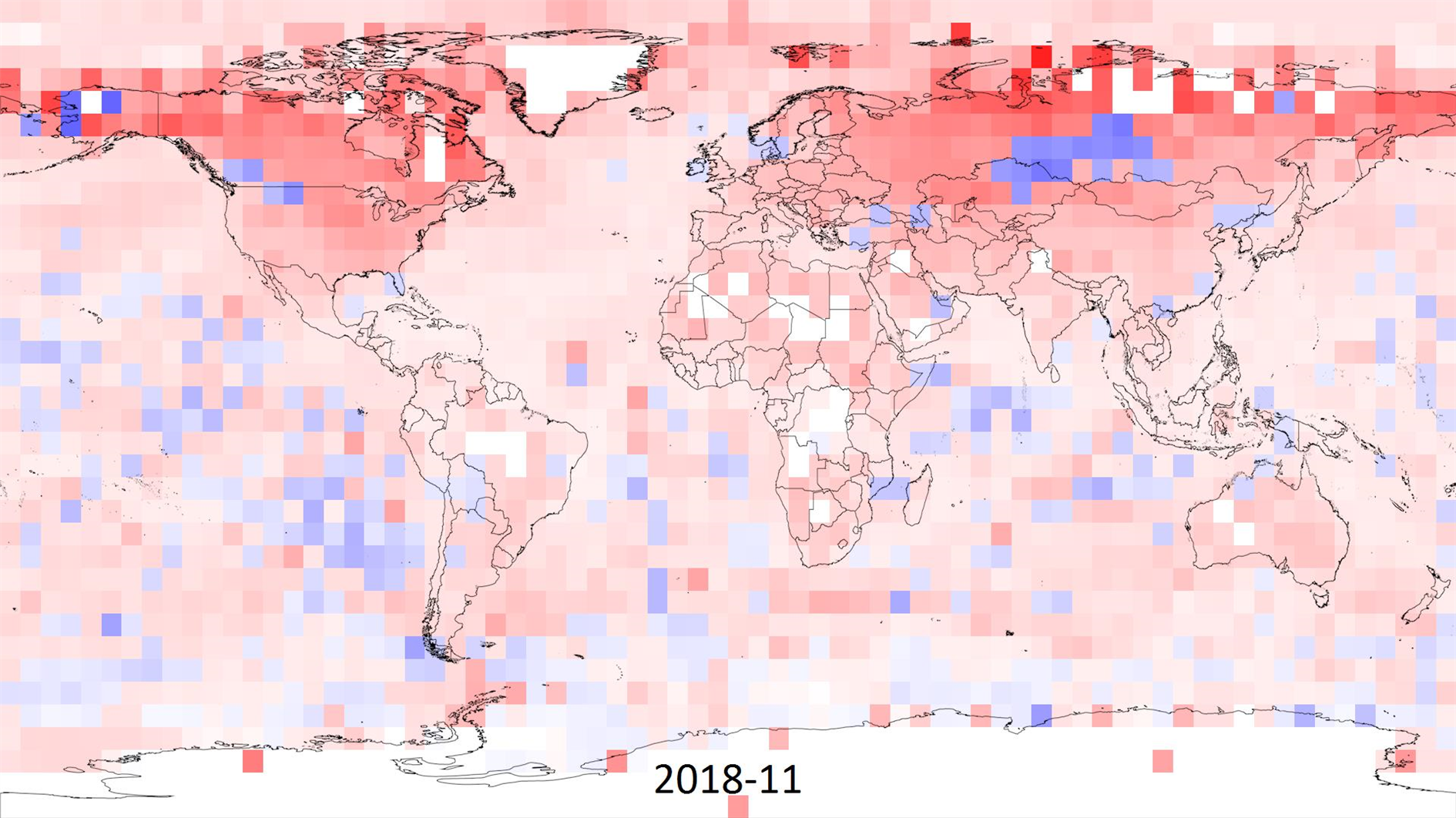
I made this animation to visualize climate change based on the HadCRUT 4 data (specifically the ensemble median gridded data) from the Met Office Hadley Centre.
HadCRUT 4 provides temperature anomalies in a five degree grid by month and year from January 1850 to November 2018 (as of this post). Anomaly here means deviation from the 1961-1990 average.
In the animation I wanted to capture the full timespan of the data but also show long term trends. Each frame is a month of data and each five degree grid of longitude and latitude is colored based on the maximum cumulative anomaly (positive or negative) for each decade. The range for color is 0 to +/- 20.85 degrees, red for warmer and blue for cooler. This means there is a reset at the start of each decade, the first few years are mostly random noise but by the end of each decade you're seeing the range of extremes.
Spoiler alert - you can spot something happening in the last three decades.
As well as the change in temperature it's interesting to watch the increase in global coverage over time. It's surprising that even the most recent years have no readings for Antarctica. Here's a paper (PDF) discussing the impact of the missing data. The HadCRUT 4 FAQ has more detail on how the temperature anomalies were assembled.
Related Posts
- Animation of a year of Global Cloud Cover
- Daily Average Global Cloud Cover Animation
- Global Cloud Cover 48 Hour Video Updated Hourly
- Coronavirus Visualization Update
- 4K One Year Global Cloud Timelapse
(Published to the Fediverse as: Global Temperature Anomalies Animation, 1850 to 2018 #timelapse #animation #climatechange #environmentalism #video Animation of maximum cumulative temperature anomaly by decade from January 1850 to November 2018 based on the HadCRUT 4 data set. )
Add Comment
All comments are moderated. Your email address is used to display a Gravatar and optionally for notification of new comments and to sign up for the newsletter.