Change in Presidential Vote from 2000 to 2020 by US County
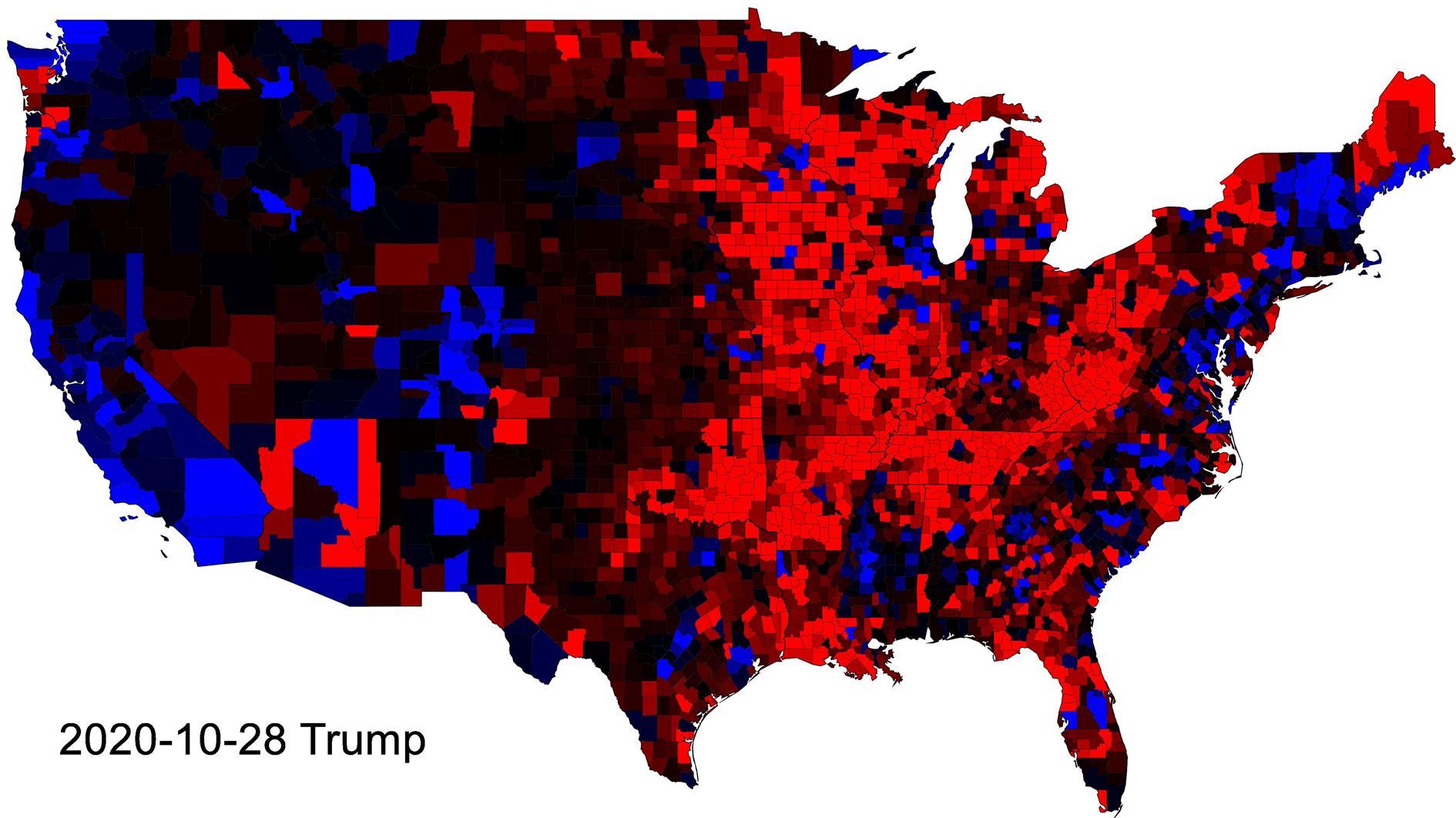
This animation shows how the presidential vote in each county changed from 2000 to 2020. Every step in the animation shows the lift from 2020 with counties that voted more Republican shaded red and Democrat blue.
The blue shift towards Obama and then the Red shift towards Trump make a lot of sense. I find it really interesting how little changes between Trump and Biden.
Note that the colors represent the change in share of the vote and not an absolute measure. A country that went from 70% Republican to 60% Republican would be shaded blue due to the shift towards the Democrat vote. The vote is interpolated linearly between elections and so when you're looking at 2016 to 2020 for instance the animation shifts each county towards the votes that they will cast in 2020. Like the electorate I ignore third parties.
Data is from Harvard Dataverse. The animation and any errors introduced in its fabrication are all me.
Related Posts
- Age and Life Expectancy Weighted Voting
- 2020 Results
- Visualizing Coronavirus Cases and Deaths by Country and US County
- Coronavirus Visualization Update
- Fuck the Electoral College
(Published to the Fediverse as: Change in Presidential Vote from 2000 to 2020 by US County #politics #video #animation #election Animation of changes in the Presidential Vote by US County, covering Bush, Obama, Trump and Biden (2000-2020). )
Add Comment
All comments are moderated. Your email address is used to display a Gravatar and optionally for notification of new comments and to sign up for the newsletter.